HBO Go Poland Usability and Visual Redesign
Problem statement
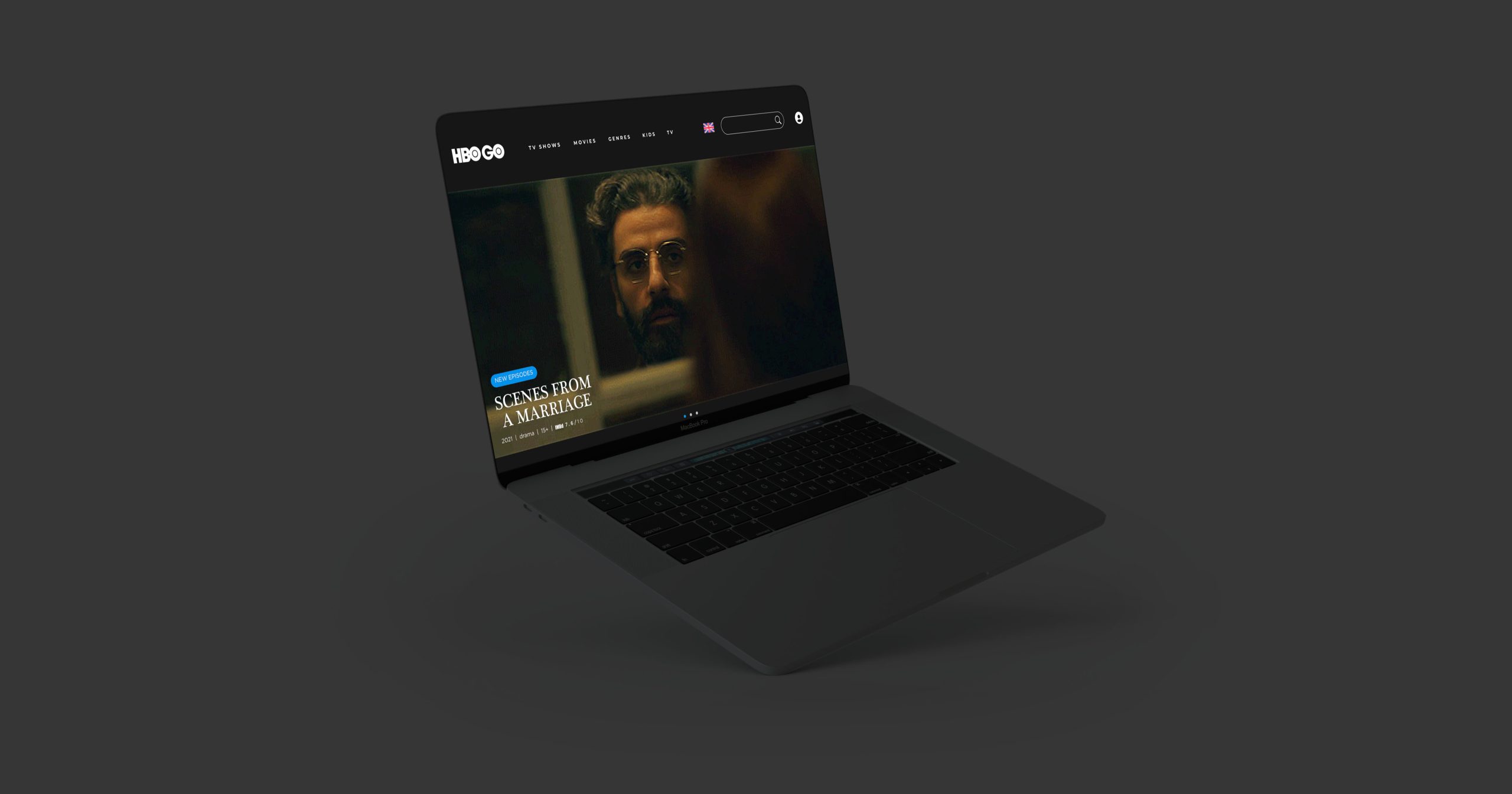
Anna, who is a TV show fanatic, is fed up having to watch her favourite shows on the HBO GO Website, because so many things aren’t working properly there.
Project
With the announcement of HBO Max coming to Poland in 2022, I wanted to explore what could’ve been fixed with the now existing HBO Go streaming service. Over the past few years I have become increasingly annoyed about the service and decided to delve deeper into the problem. I interviewed multiple friends and family about this app and got similar results and thought “why not make this nightmare into a case study for my portfolio”.
Market
According to MediaPanel research, in August 2021, Netflix had 11.9 million users in Poland, which makes it 31.7% of all Polish people. HBO Go, on the other hand, had 2.8 million users which is a huge difference, standing at 7.7% of Polish People. HBO Go stands 5th on the list of the most popular VOD services in Poland and it has lost 8,6 thousand users compared to the previous month. It is estimated that the HBO Max coming to Poland in 2022 will show a much bigger increase in users compared to HBO Go and might prove to be a strong Netflix’s competitor.
Goal
- decrease the subscription drop rate by increasing the usability of the service
- show potential of the service to new or old users
Challenges
- Identify existing problems across all the platforms in order to make the experience better for every user regardless of device.
- Redesign the architecture of a complex streaming service to make it easier to navigate and use.
Objectives
- carry out user research to understand problems and annoyances when using the HBO GO website or mobile and TV related apps,
- come up with better architecture of the service.
- simplify the visual design of the service.
Project Type
Platform redesign concept
Responsibilities
UX/UI Design, Visual Design
Tools
Figma, Adobe Illustrator, Miro
Time
30.09.2021 – 16.10.2021
2 weeks, but roughly 40 hours of work.
Target Audience
Males and females 23-55 years old. Possibly previous HBO Go users
1
Research
Research Goals
- identify the demographics of customers who use the app .
- identify reoccurring problems within the service.
- identify what the service does good.
- carry out a competitive audit to see what other apps do better or worse.
Interviews
I have interviewed my friends and family and I was shocked to find out that I’m not the only person with such strong feelings towards HBO Go.
There were a lot of negative answers when it came to the usability problems within the app with a lot of common themes, which I have listed out on the right. I was fascinated and entertained by the fact that people could point out specific features that didn’t work well, as if their hatred towards the platform was somewhat inherited. Interestingly enough, the issues are common across different devices regardless of the dedicated apps or website. People felt the strongest about the progress tracking and user settings, meaning the app or website often doesn’t remember what episode a user is on or what part of an episode a user finished watching. Another problem is that the app doesn’t remember users’ choices and always goes back to default audio and subtitle settings.
I had to dig deeper to find out what was going on on the website, because my annoyances mostly came from the Playstation 4 HBO Go App. As it turned out, the settings change at random. You could watch a few episodes without any trouble, to only then be met with disruptions, when the app suddenly doesn’t remember your previous settings. With that in mind, I went onto challenging the app on different web browsers and that is when I experienced the full rage.
Even though there aren’t multiple accounts on the service, when going from device to device, or browser to browser, the app won’t remember your settings. More than that, the app won’t remember your settings when you turn off your device and put it back on. As if everyone had their cookies disabled, but hey, we know they don’t.
Other than that, I found out that people loved the available series and movies on the HBO Go service and only continued to subscribe because of them and the relatively low price compared to Netflix. Some friends said they used it rarely because it was an inconvenience whenever trying to find something new and only continued to use it because of reoccurring episodes or movie series such as the Harry Potter movies.
The users also pointed out that it was super annoying compared to Netflix that you didn’t have multiple accounts.
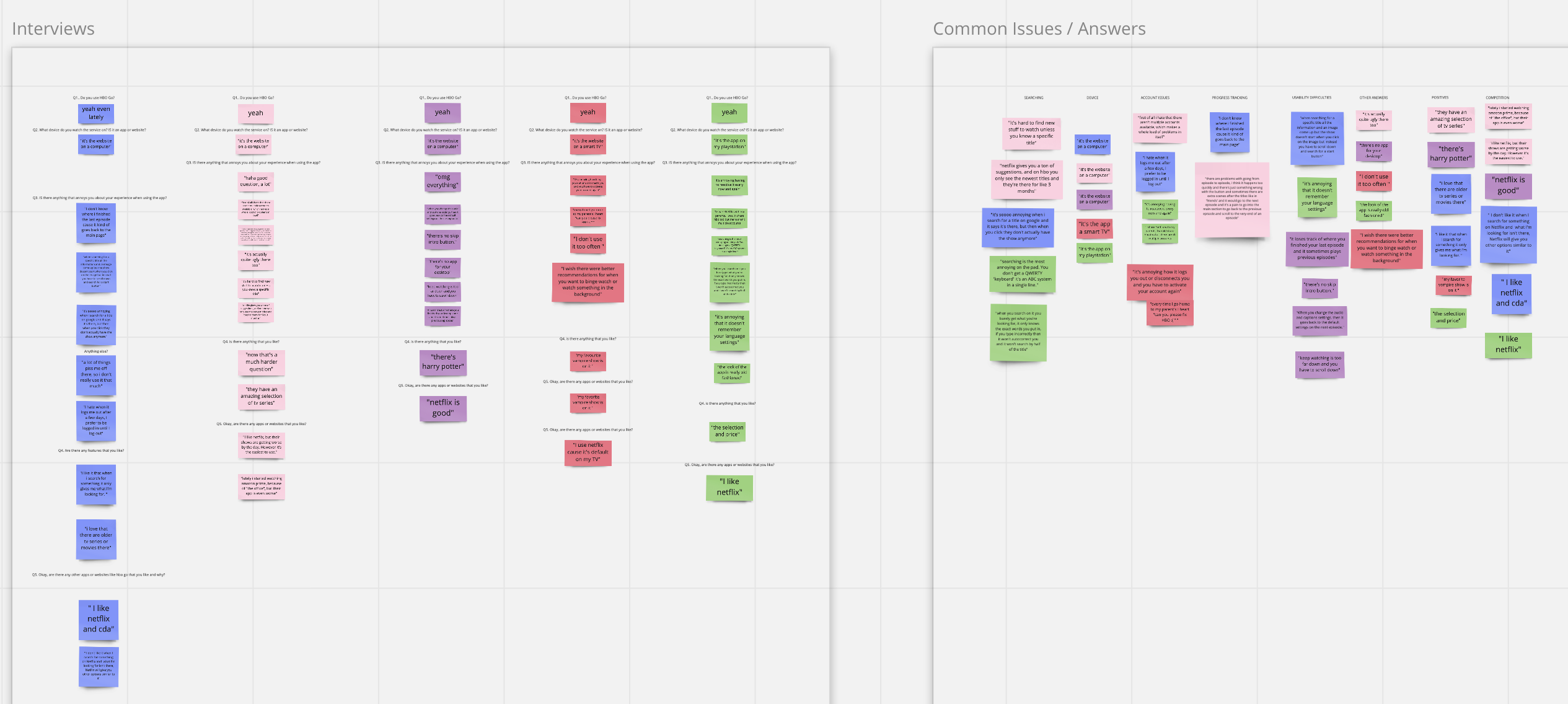
I noted my interview down in Miro, so if you want to read more then click on the button below ❤️
Interviews Detail
Number of interviewees: 5
Age bracket: 26 – 46 Polish females and males
Platforms to consider
Web: Desktop( a lot fo users due to the lack of a dedicated desktop app + people who watch while working)
Apps: Tablet & Mobile, Smart TV, Consoles
Common Issues
- usability difficulties – the app doesn’t remember user settings
- account problems – logging out
- account problems – no multiple accounts
- progress tracking
- unattractive visual design
- search difficulties
Main Takeaways
- A lot of users either stop the subscription altogether or use the platform a lot less because of the usability problems
- The app has amazing TV shows and movies, but the search and discovery of the platform stops people from engaging
- The fact that the app doesn’t track user activity makes it really hard for people to enjoy
P0 issues to address
- Discovery
- Time on task
- Layout
- Search
Persona
Based on the primary and secondary research, I came up with a persona for this project. The end users are most likely to be between the ages of 23 to 55 years old. I decided to go for a persona aged 31, because that’s the age average of my interviewees.
“I love the shows and movies on the platform, but the app gets so many things wrong that I often choose not to go on it and go to other services that are easier to use.”
Anna
Age: 31, Occupation: Secretary, Education: Bachelor’s Degree, Location: Warsaw, Status: Single
Anna has two states when watching TV series, they either play in the back or she binge watches an entire season on a Saturday. She appreciates HBO Go for niche movies and series, but also gets excited when a new cool show is added. She prefers when new options are shown to her based on her previous choices, because she sometimes can’t decide what to watch. She and her family share a lot of services together, so it would be great if she could do it on HBO Go too. Oh, and, she loooves horrors.
goals / needs
- She wants to be able to continue watching whenever she ended previously.
- She wants to be shown new choices based on her previous watch history.
- She wants to share her account with her friends and family.
frustrations / Fears
- She hates that the platform doesn’t keep track of her previous choices.
- The search feature isn’t smart.
- It takes a lot of unnecessary effort to start watching.
- You actually have to click on the play icon for a title to play, if you click on the poster then you’re sent to a subpage with information.
Anna’s story
As a TV show binge watcher, I want to be able to continue on watching my favourite shows without pointless scrolling and clicking, so that don’t waste my time pointlessly.
Anna’s current journey
Journey Map
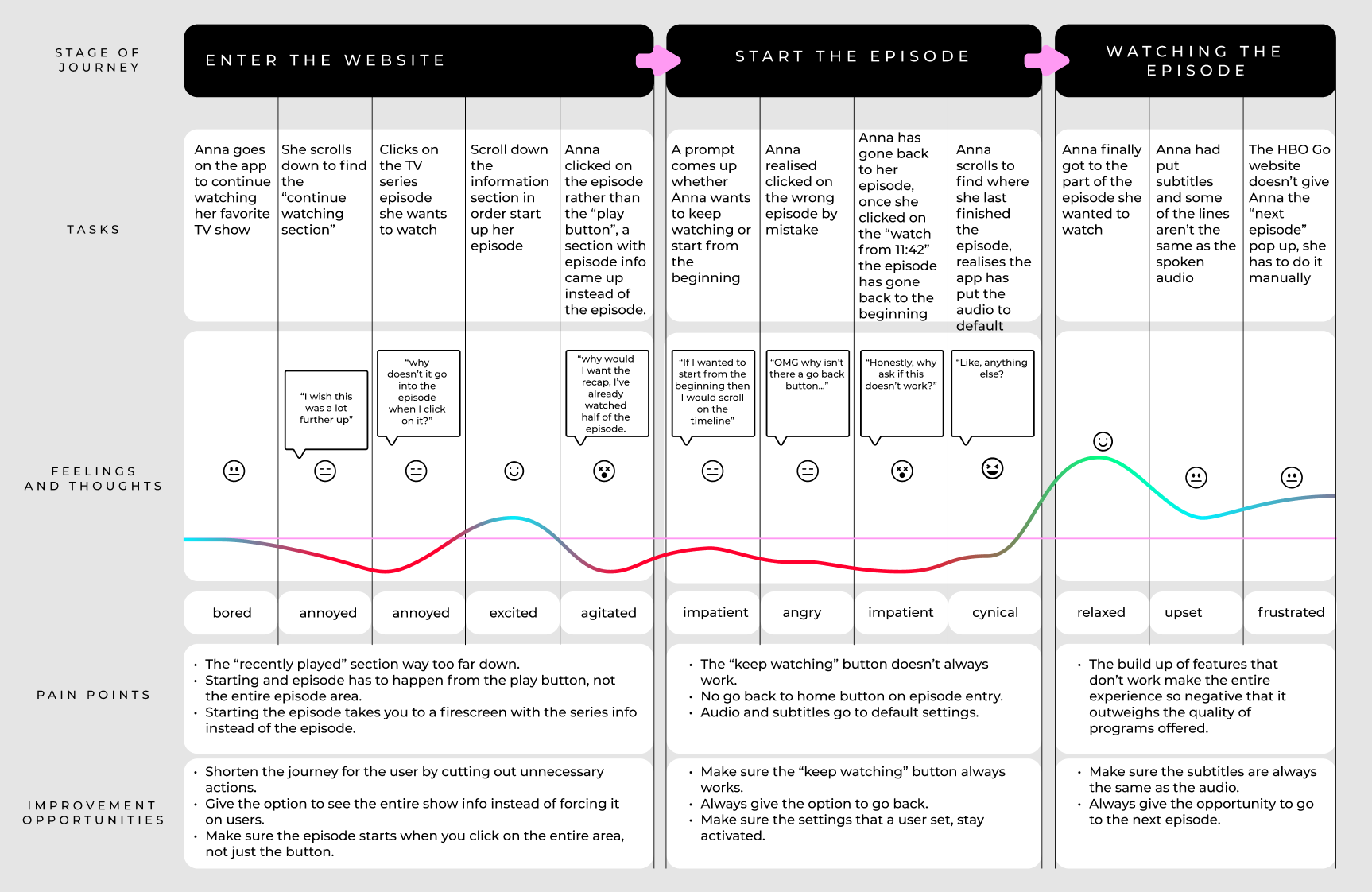
I have gone through the website multiple times in order to map out all of the negative experiences a user goes through the current website in order to fully demonstrate the extent of the problem.
Persona: Anna
Goal: Go on the current HBO Go Website to continue watching her favoUrite TV show
Competitive Analysis
While conducting secondary research I came across an article about different VOD services used in Poland. Based on this information I analysed the 5 most popular services, excluding HBO Go.
Direct

Price Per Month
29zł to 60zł
strenghts
- A lot of international content
- Easy to use
- Good recommendations
- Multiple accounts
Weaknesses
- No individual movie rating
- High starting price
- Seems like there aren’t many options to watch
Direct

Price Per Month
8zł – 45zł
strenghts
- International productions
- TV Channels
Weaknesses
- Starting price includes adverts
- Push on Polish productions
Direct

Price per month
19.90 zł
strenghts
- Low price
- a lot of choices
Weaknesses
- bad visual design
INDirect

Price Per month
44,99zł – 75,99zł
strenghts
- International selection
- TV + VOD
- You get a lot of TV channels
Weaknesses
- High starting price for VOD
- More like regular
inDirect

Price Per month
50zł
strenghts
- A lot of niche movies and series
Weaknesses
- Only Polish productions
- High price
2
Information Architecture
Site Map
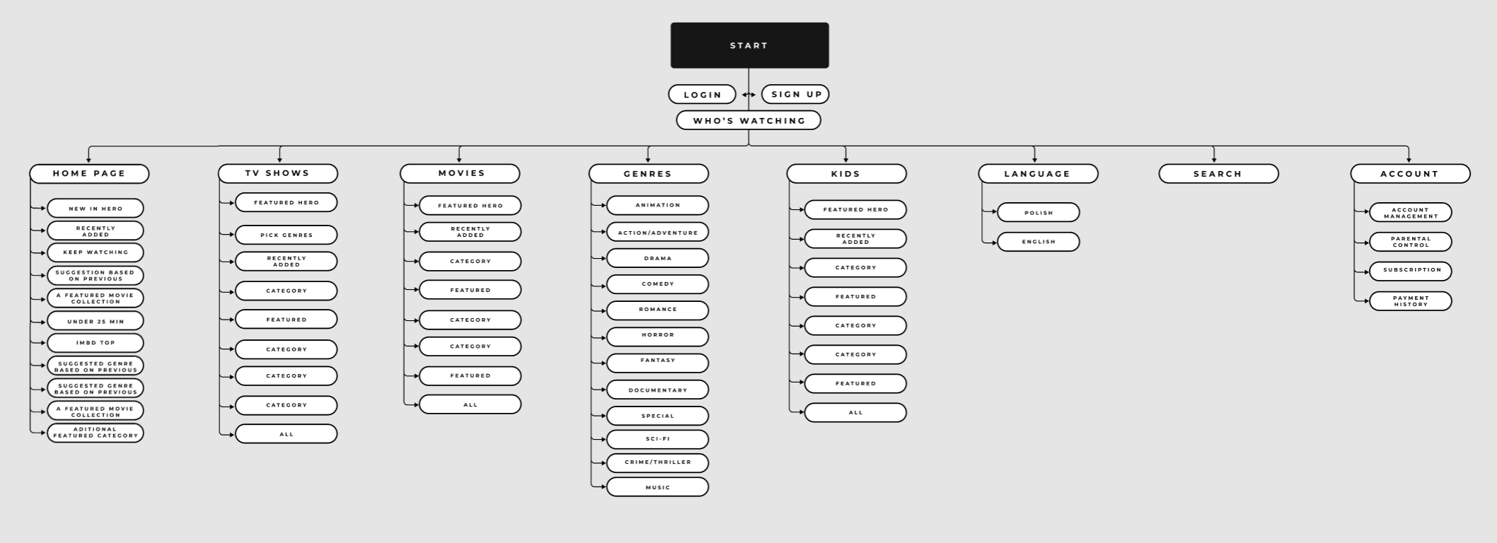
I decided to rework the architecture of the website and focus on the categories and suggestions of titles. Some of my interviewees pointed out that they would like to see categories for everyday life, such as “watch while cooking dinner” or “let it play in the background” rather than actively watching. And truth be told, a lot of the time people consume media in a passive way.
With this in mind I have restructured the categories on each subpage and made subpages much shorter. Current homepage is 32 rows down, which is way too long since users don’t want to scroll that far down. I have shortened the amount of category rows to 11 and focused on individual needs of each user. This way they homepage is customised based on previous interests with some static categories that would be shown to all users, such as IMDB Top or The Bond Collection categories.
User Flows
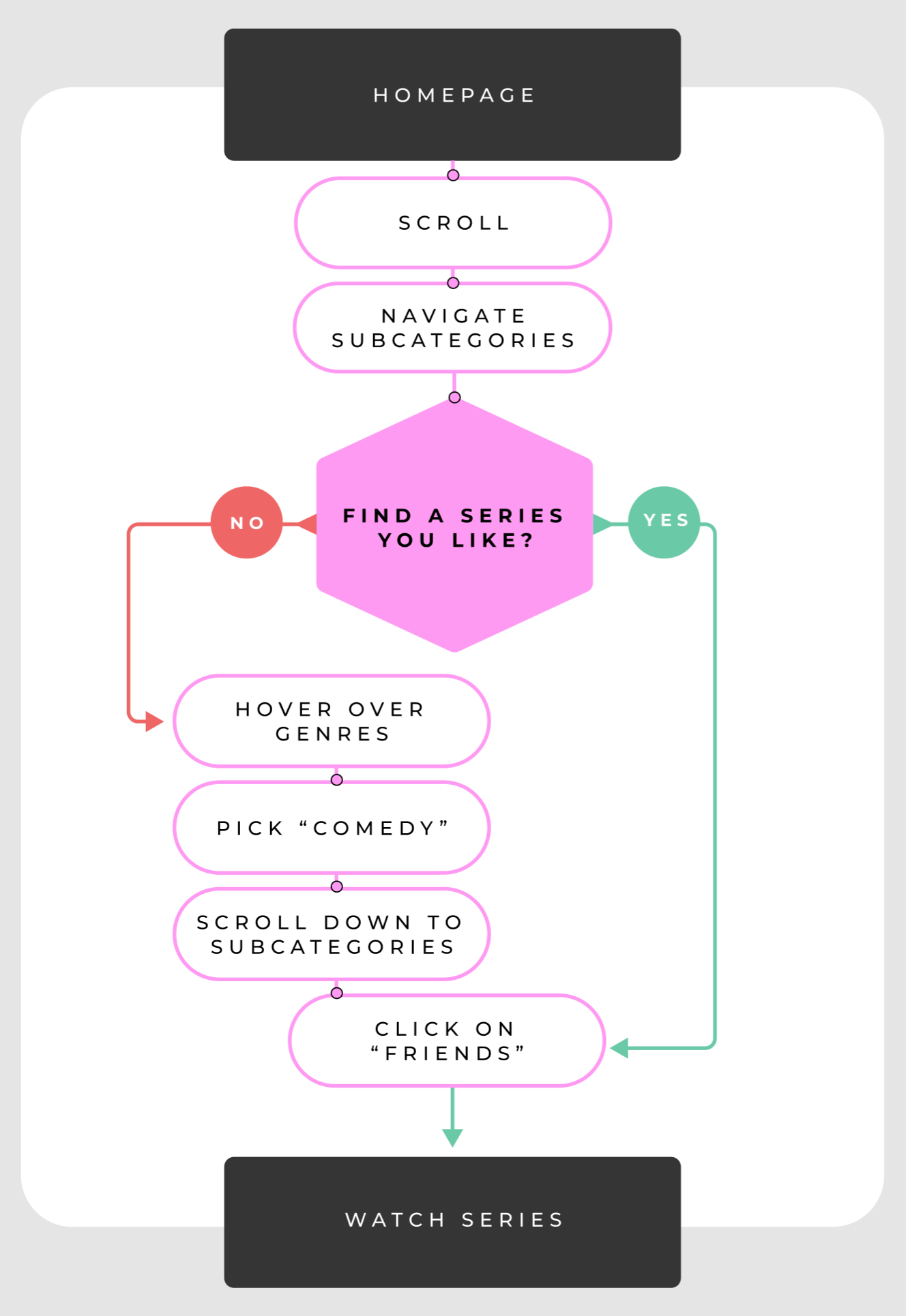
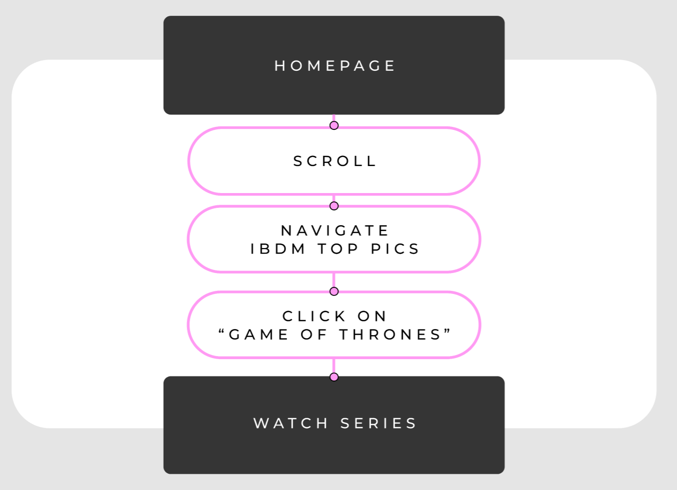
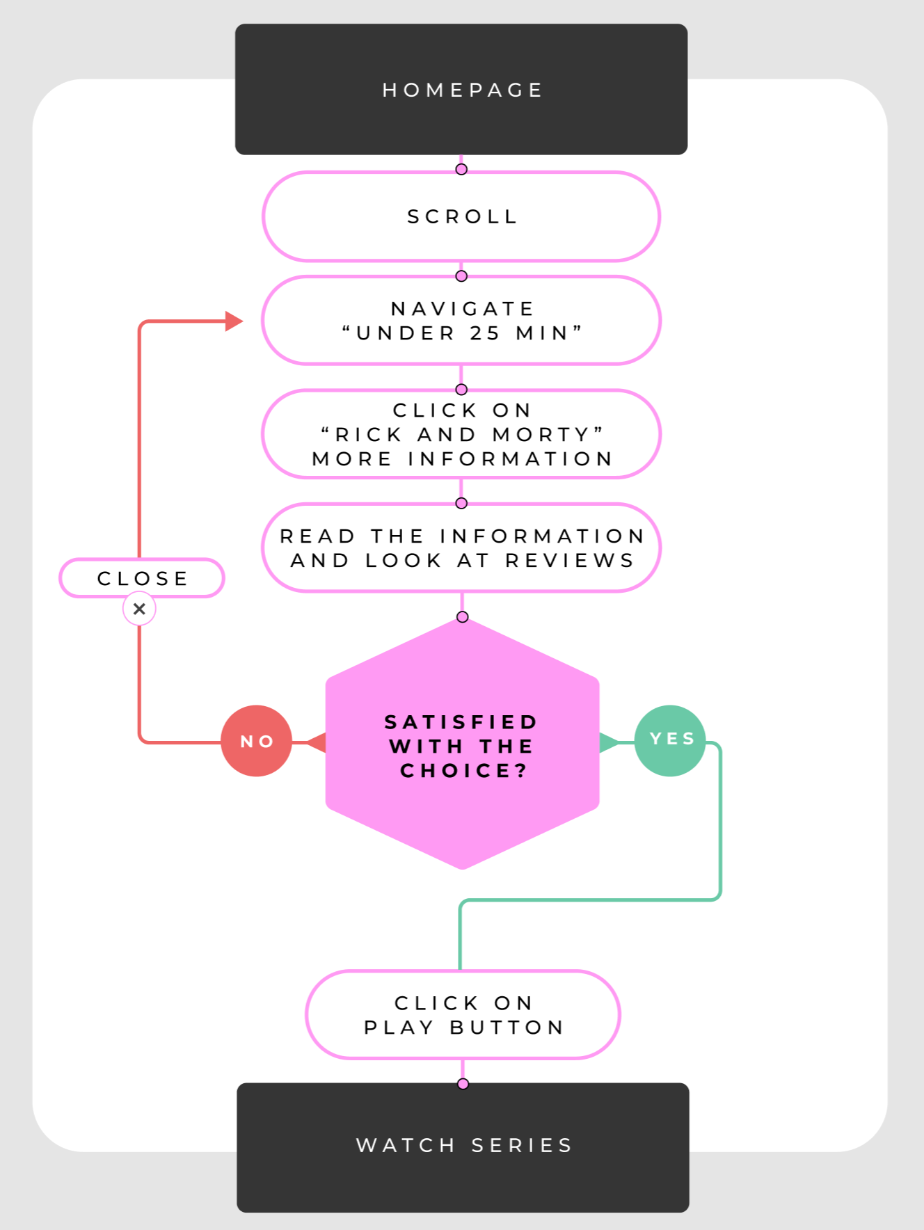
I wanted to explore 4 basic user behaviours based on my previous interviews. The first 3 flows are short and to the point with a different level of needs of the users. The last flow is longer with a much more particular user with very specific needs. I feel that most users are casual or specific, meaning they want content to find them via the homepage or find specific content themselves, whether it be by genre or title.
User Flow 1
As a busy mum, I would like to put a show on in the background while taking care of my toddler
User Flow 2
As a hangover student, I want to just binge watch something for the whole day
User Flow 3
As a tired corporate worker, I just want to watch something quick and easy before going to sleep
User Flow 4
As a first time user and a tv connoisseur, I would very much enjoy a little bit of a niche find indeed

3
Interaction Design
Discovery Issues
One of the main issues with the current service is searching for new things to watch and I would like to break it down into two sections.
1. Searching
2. Recommendation system
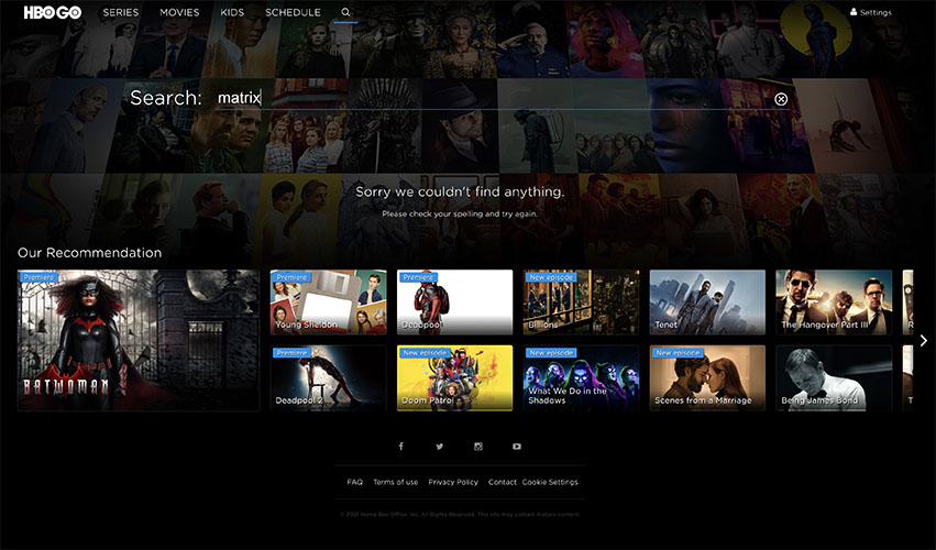
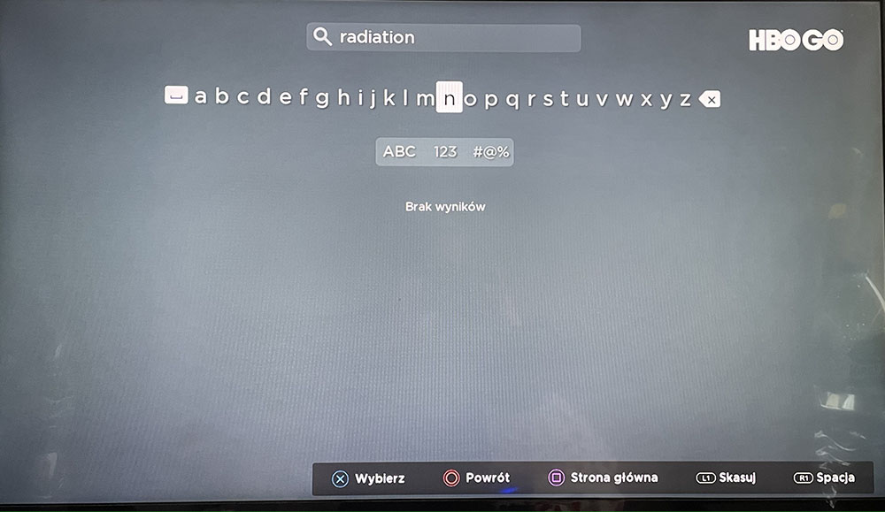
The first problem with searching is that the current Search page doesn’t show you results unless you type in exactly what you are looking for. You can’t even search by keywords. The Search feature does’t recognise spelling errors either. The second problem is the Search feature on the Playstation App. The app doesn’t give you the default QWERTY keyboard that is on the entire Playstation system. Instead you get an ABC type keyboard.
1. Searching
solution 1 for the website, mobile app and playstation app
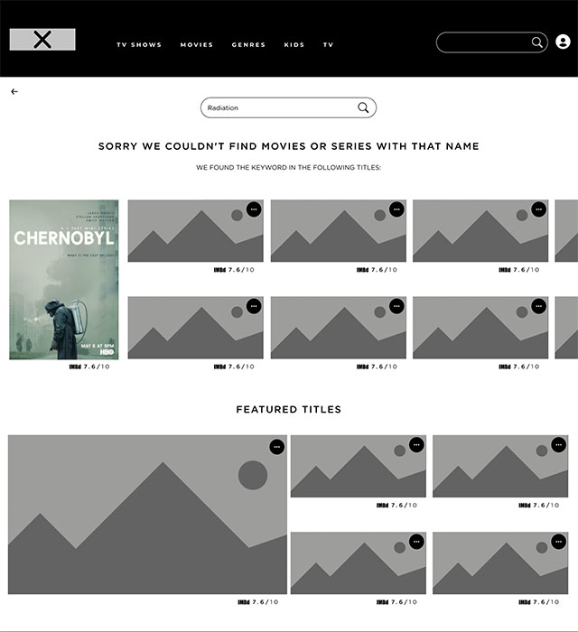
The solution is to make the search feature a lot more user friendly, by showing users options they might be interested in whether they type a genre instead of going into the genres or a word that they associate with a movie they’re trying to find. Instead of typing “movies about radiation” you would simply type “radiation” into the search bar and “Chernobyl” would come up alongside other radiation related titles available in the service at the given time.
current search screen
Redesigned search screen
additional solutions for TV and console operated apps
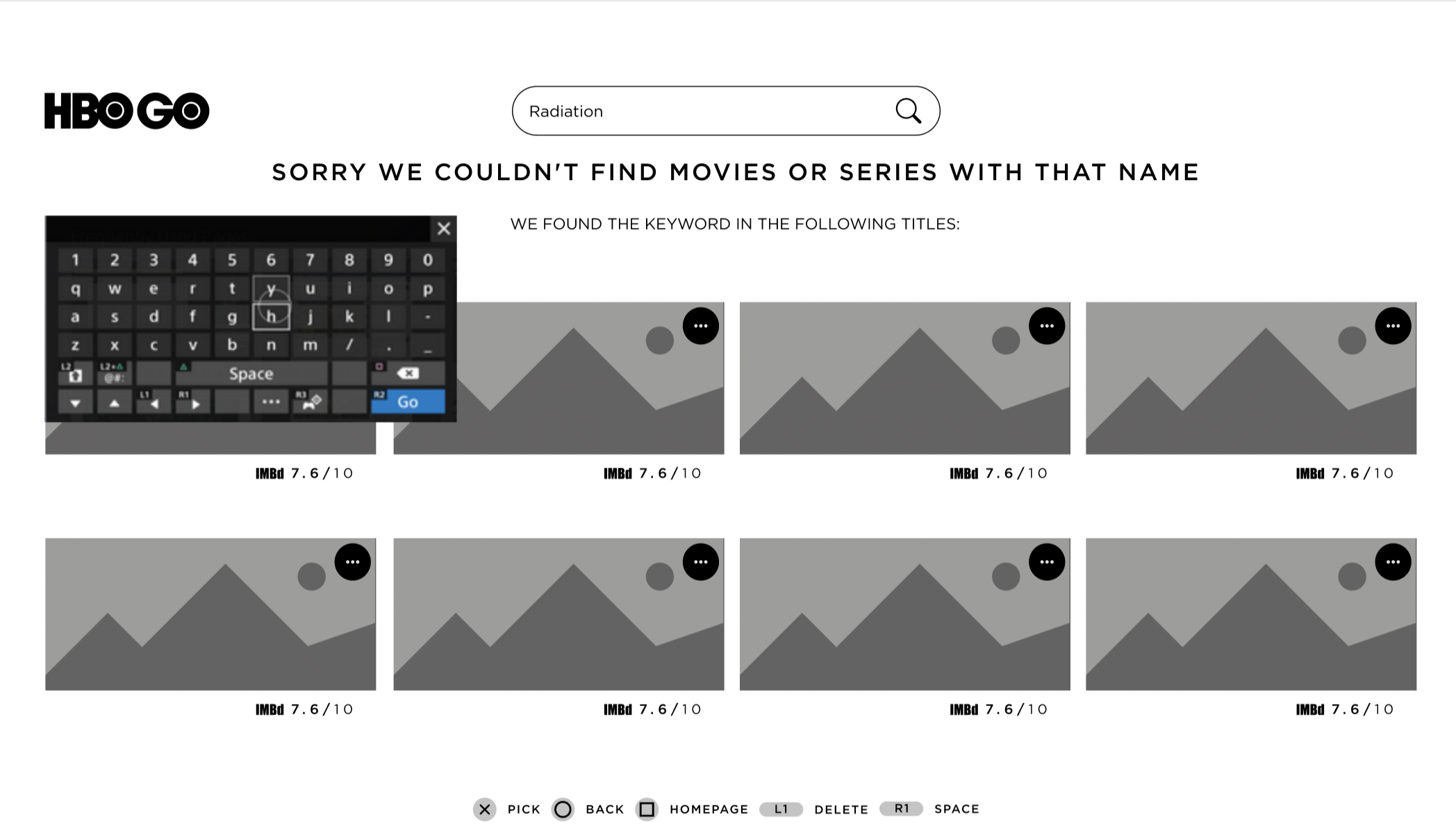
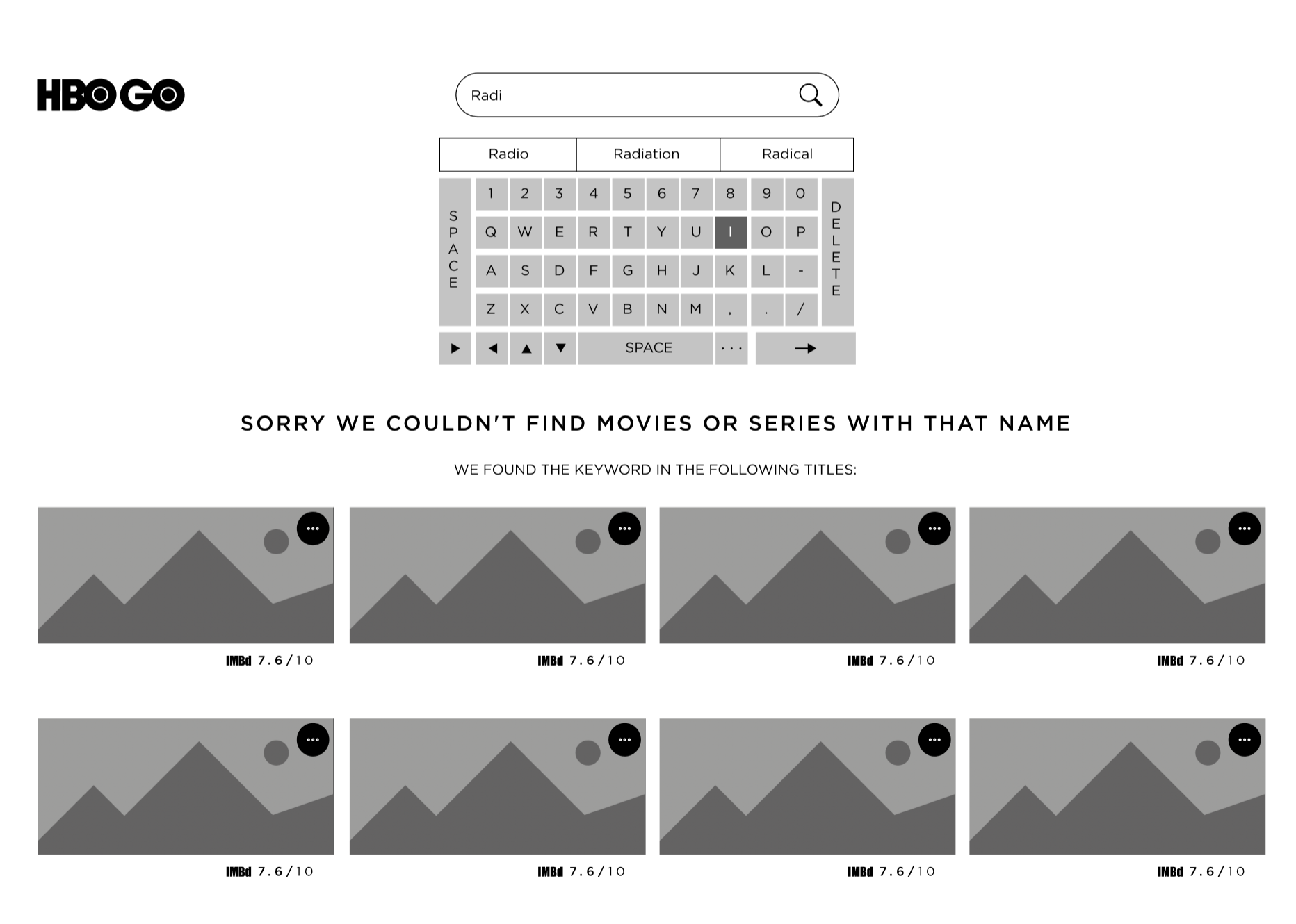
Apart from the above mentioned improvements, the solution to improve the TV versions of the service is simple and it is to use a default keyboard, like on the Playstation App, or use a QWERTY system built in within the app that would help with text prediction to make the typing quicker.
current search screen
Redesigned search screens wireframes
2. Recommendation system
User centered approach
I think the main issue with the current recommendation system across the service, regardless of device, is that a user is not considered at all. It seems to me that there is a person who is combining a list of recommendations and categories based on titles that someone thinks other people might enjoy, without any user considerations or watch history.
missed Opportunity
As you can see below, the section is unscrollable. It would be okay if this section was about showing you everything they had to offer, but it’s called “Our Recommendations” which would suggest picked examples for a user, especially because, right next to it in the sub navigation on top, we have a section called “Featured” where the platform could put everything they actually want to show to every user.
Original homepage Design
had to be broken down into 3 parts cause it was too long.
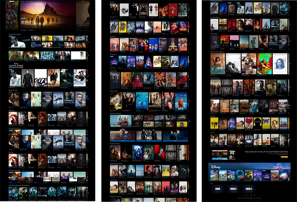
current “Our RecomMendations” On The Mobile HBO GO APP
current “Our RecomMendations” On The HBO Go homepage Desktop Website
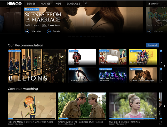
current “Our RecomMendations” section On The HBO Go Desktop Website
My design
Redesigned Section based on three previous titles shown on desktop
I have rebranded the section “Our Recommendation” to “Based On Previous Choices”, getting influence from Netflix, but evolving the idea by stretching out if a user watched more than one position. After a pool of related titles would finish, there would be a possibility for featured titles to appear once more.
Time-on-task Improvements
I would have implemented other small changes that are a huge usability improvement, such as:
1. Start to watch
I would strongly recommend a change with the touch target size of episode start. Instead of the current setup where you have to click on the “play button” I think the entire area of the episode poster should direct straight to the episode.
2. Player Controls
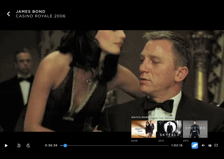
A change within the player options, by adding the “previous” and “all episodes” buttons on the TV Series player and “more in collection” on Movie players when there’s more than one movie in a series, such as Matrix or Bond Movies. This would save users having to go back to homepage to find a movie next in collection.
1. Start to watch
current task
simplified task
2. Player controls
current player controls

Improved player controls
4
Visual Design
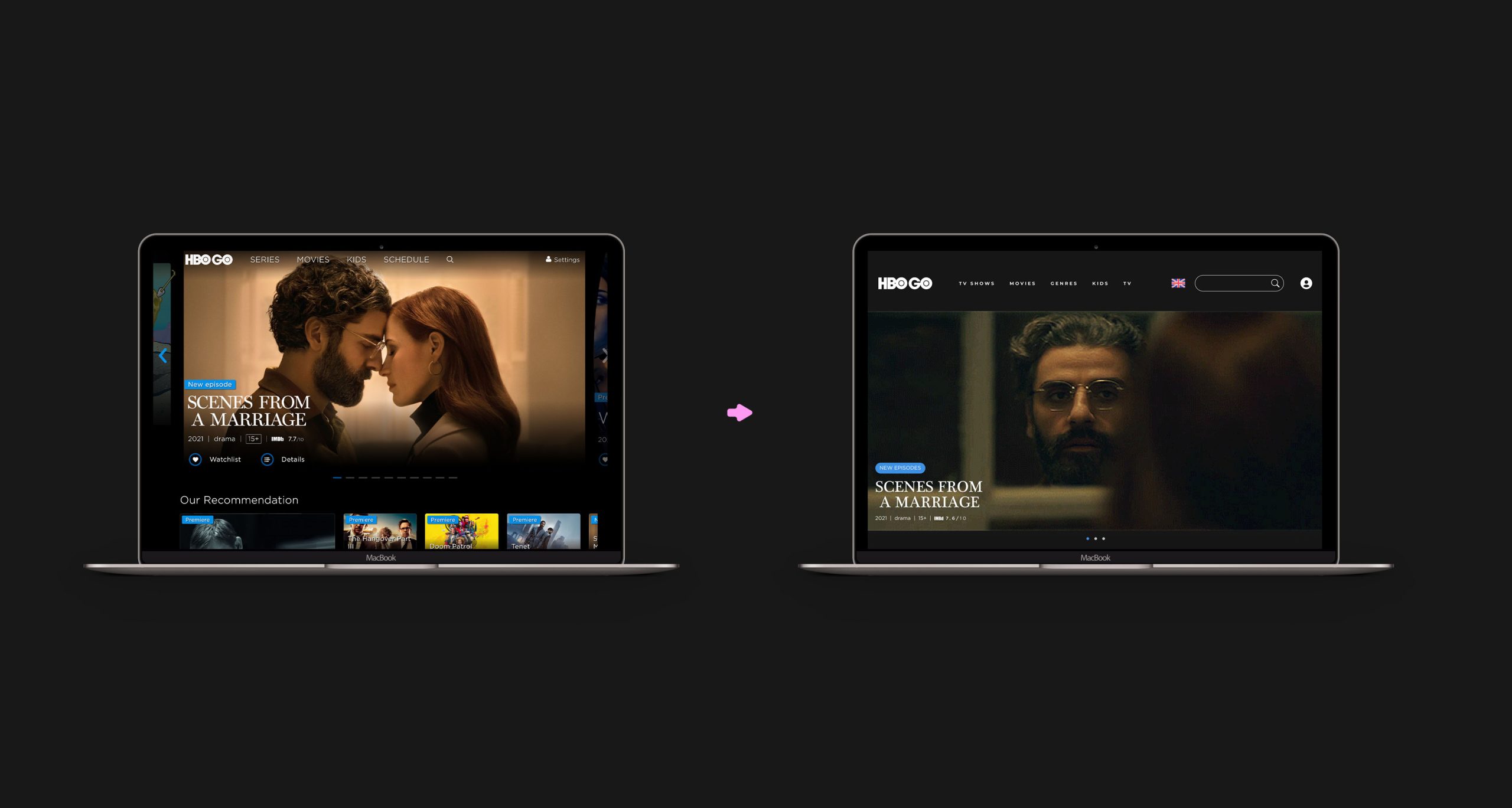
Visual Design Update
Component Design
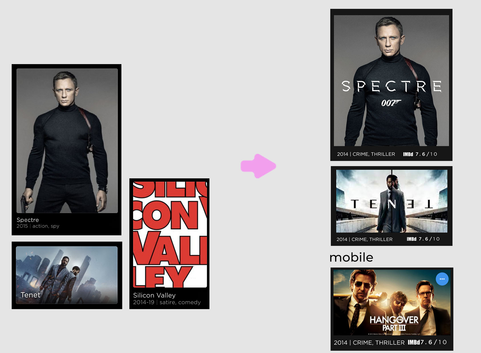
I would say the majority of the redesign comes to how the main components within the service look. I made them slightly more informative in order to avoid what the platform was doing, which is not playing the show or movie, but instead showing you a break down of information.
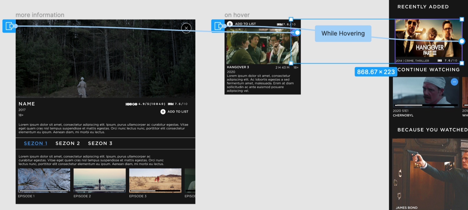
Now you can see a poster with a title rather than an image with a written title. This not only saves space, but also builds a strong mind connection to when people see posters of a movie in advertisement. I also added a little “more info” button up on top of each component hover state, so that if a user wanted to see a full breakdown of information like previous, then they could. The components on mobile would have the “more information” button always visible because, obviously, no hovering on mobile.
The whole design
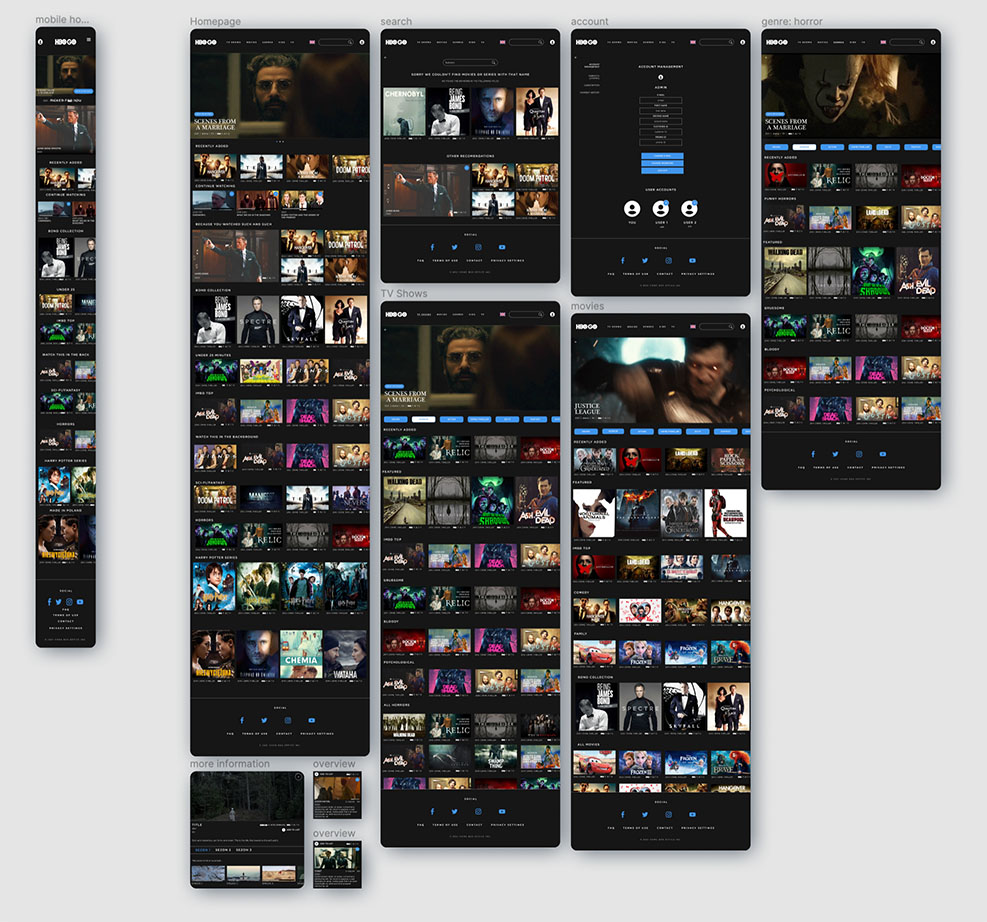
The visual design update as a whole isn’t huge, I felt that the current look of the service isn’t the main issue. The visual update makes elements more flat and modern. The biggest change is the layout and information architecture of the pages. The original page is very cluttered and it’s hard to find what you’re looking for. A simpler and personalised website would help users find what they’re looking for without having to endlessly scroll through the website.
My Design
High Fidelity Prototype
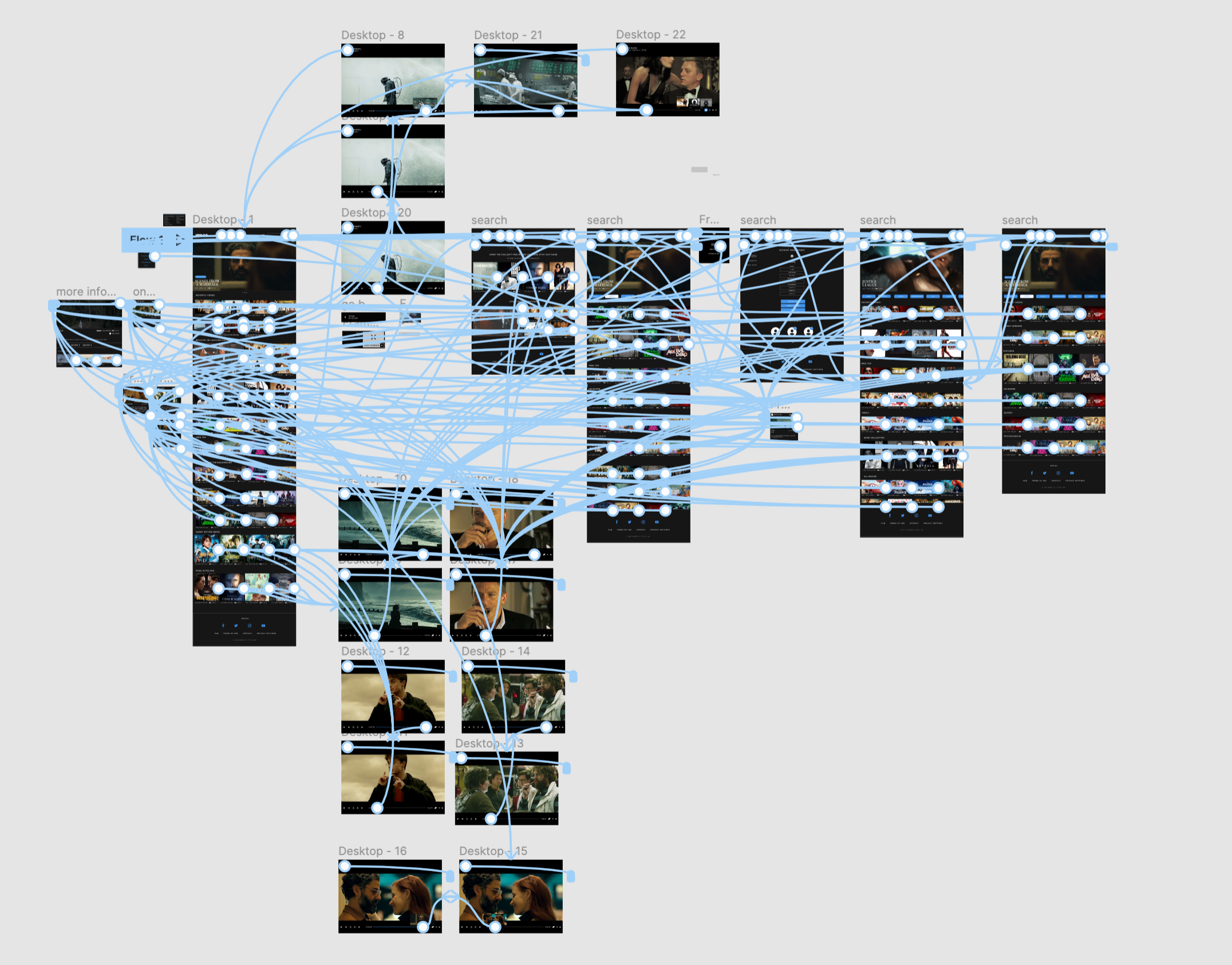
One of the most unappealing aspects of the original design was how it was static until you watched your choice. I wanted the website to live and have life previews of the things you want to see.
Please bare in mind, you have to move your mouse off the hover components before scrolling down. It’s suuuuper annoying but I couldn’t find any info on how to stop that from happening since it’s an opened overlay.
Thank you, love you, bye!
This is the end of this project. Thank you if you managed to get to the very end.
Next Steps
The next step would be to redesign the entire visual aspect of the platform together with the mobile app, smart TV app and Playstation app. It would be easily manageable with the redesigned components and with some iteration to the usability improvements that I have explored here. Most of the improvements are scalable across all the devices with small changes where using a pad or touch.
What I would’ve done different
The prototyping. I mean Figma is great, but the prototype tool lacks some very basic features, such as default hover states which are available in other prototyping tools. This drove me insane and I downloaded Origami Studio and tried to prototype this in XD as well, but I had already invested so much time into the Figma prototype that I would’ve essentially had to remake a lot of the elements from scratch and since this is a concept case study and I do need a job pretty soon I left it as it is but if this was a real project, I would’ve redone the entire prototype in Origami or Quant, so that any usability studies are a lot more fruitful. Next time lucky I guess, but it’s really bogging my mind at this point. I hope you didn’t mind it too much.
What I learned
This project has definitely opened my eyes to different user approaches because even with such a strong set of negative feelings towards the service from so many users, I got some contrasting opinions and trying to accommodate them was a good part of the design process.
Take aways / challenges
I think the main challenge that I faced in this project was to make improvements that are not a Netflix rip off. Everyone I spoke to loved Netflix for the main part, so I looked at a lot of things that they did right and I really tried hard to come up with new ideas, so that I don’t just copy someone else’s hard work over at Netflix. With that I wanted to make sure that I don’t fully change HBO Go and only improve upon what’s already there.

