Problem statement
Tom, who is severely allergic to nuts, needs an app that will allow him to choose his meals carefully and let the restaurant know of his allergies in a clear fashion, because he is otherwise scared of ordering food online.
Project
This is a concept that I have came up with for a food delivery app that is mostly targeted at people with allergies or dietary preferences. People would pick their preferences before going to the homepage and the app would give users suggestions on what they could order or what ingredients needed to be swapped. With time, just as social media apps show users content based on their interests, this app would show meals and restaurants based on previous orders and preferences through an algorithm.
Challenges
- The difficulty in this project is to figure out a clear and user-friendly way to navigate around an app that shows you individual meals as well as restaurants based on an algorithm.
- Another difficulty is the extensive filtering system. The app has to be simple, so that people of all ages can easily understand it and that it is accessible to people with visual disabilities. Therefore I had to do a lot of iterations to simplify the final design.
Objectives
- carry out user research to understand problems and annoyances when ordering food online
- carry out food allergy research
- design the app
- design the logo and branding
My role
UX research, UI Design, Visual Design, Branding.
Tools
Figma, Adobe Illustrator, Miro
Time
08.09.2021 – 29.09.2021
3 weeks
1
Research
Research Goals
- identify the demographics of customers who will be interested in this app,
- understand problems people with allergies face when ordering food,
- understand problems people with visual impairment have when ordering food,
- verify competitors or business models for an optimal user experience,
- find out about common allergies.
Interviews
I spoke to my friends and family regarding the possibility of an interview. I decided that my mum (46) and friends ranging from 26 to 38 years old would be the best fit for this exercise.
I found out my mum doesn’t use mobile apps at all and when ordering food she prefers to call the restaurant directly. Asking why, she replied that she usually knows where she wants to order from and doesn’t experiment in case a new place gets her meal wrong. She is a vegetarian and gets annoyed when scrolling through apps, restaurants might offer only 2 vegetarian meals and she’s tired of constantly going back to the main menu to search for a new restaurant.
The second part of the interviews produced very close results. It is crucial for the users to know when the food will get to them through time estimates and live-location services of the couriers. This is why they are more likely to use services like Bolt instead of personalised apps. I also found that services that offer discounts when ordering are a lot more popular, the reason being that if they are to pay the full price they would rather go to the physical restaurant and get warm, freshly made meals, after all fries taste best hot.
It was also often said it is very important to see the overall rating of a restaurant. It would be nice to filters specific meals by rating. One of the interviewees hates onion with a passion, she’s often worried that if she puts a disclaimer in the notes then they won’t look at the optional information and include onion in the meal. This is what I’m personally worried about too since I’m allergic to walnuts.
I’m often worried that if i order a meal and put a note down about changing an ingredient or making the meal vegetarian, then it will be overlooked. It’s happened before where I requested no meat and got bacon on my meal.
Personas
Based on the interviews I came up with a persona for this project. The end users are most likely to be between the ages of 22 to 50 years old. I decided to go for a persona in their 40s, so that the final layout will be simpler to understand to all age groups. The customers would mostly live a busy life and are very specific about their needs. My initial research also shows the need to accommodate users who will need some extra features in order to build their trust in the product.
“My severe allergies often make me unable to order foods through apps, I know that I can always call the restaurant but I’m not fluent in Polish so speaking on the phone makes me nervous, I’d prefer to write my needs out and know they won’t be ignored.”
Tom
Age: 45, Occupation: Programmer, Education: Master’s Degree, Location: Warsaw, Status: Married
Tom has recently moved to Warsaw with his family to pursue his career in programming. His wife usually cooks dinner, so he likes to treat her to a few meals a week. They are both vegetarian. Sometimes he’d just like to order in and watch movies together, but he is scared to order off of food apps because he is severely allergic to nuts. More over, his wife is intolerant to gluten, so that makes the food ordering process even harder. To put it simply, he is tired of ordering salads.
goals / needs
- Clear indication of allergens and ability to write specific needs.
- Be able to filter for vegetarian or vegan meals.
- Wants to see the rating of restaurants.
frustrations / Fears
- Scared to order meals that might include allergens.
- A lot of apps show restaurants with vegetarian or vegan menus but not individual meals.
- Hates it when he can’t see when the meal will arrive.
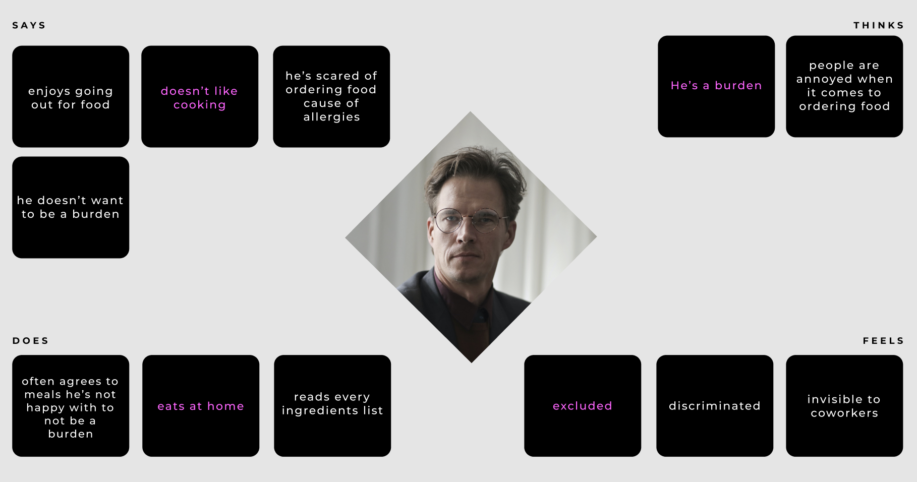
Empathy Map
After creating the persona for an end user, I decided to go deeper into their specific needs and feelings. This step was particularly important to me in order to fully understand their conscious and unconscious decisions when using the product. I wanted to focus on solving direct issues and then evolve the design with them in the centre.
User stories
In addition to my main persona, I decided to go with additional user stories to have other users’ problems in mind when creating the final product.
End User

As a severely allergic person, I want to trust the restaurant, so that I do not get an anaphylactic shock when I order food.
regular user

As a vegetarian, I want to be sure that the food I order is meat-free, so that I don’t have to throw it out.

I hate onions, I want to be able to take them out of a meal, so that I don’t throw out my meal when it arrives.
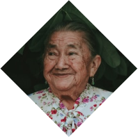
As an elder, I want the app to be simple, so that I can understand how to use it.
edge user

As a blind person, I want to be able to use a screen reader while using the app, so that I can successfully order a meal.
Competitive Analysis
As a foodie I already had some ideas about what makes a good or bad food ordering experience. I order food around 2 times per week and have worked out some favourites! However, I wanted to delve deeper into the topic in order to prepare a viable competitive analysis.
According to PMR’s report 11% of polish people ordering food ordered food several times a week or more which is a huge number! With such a vast number of people ordering, there is room for potential to create new apps and services in the food ordering category.
Direct

strenghts
- Food ordering app
- Simple, easy design
- Shows discounted restaurants
- Gives an estimate
- Restaurant contact info for allergies
Weaknesses
- No Filter
- Time estimates often wrong
- Doesn’t fully verify drivers
Direct

strenghts
- Food ordering app
- Verified drivers
- Easy to navigate between delivery or pickup
- Shows you a map of nearby restaurants
Weaknesses
- Cluttered design
- Limited filter options
- Time estimates often wrong
- Long scrolling
Direct

strenghts
- Food ordering app
- Lovely simple design
- Easy to navigate between delivery or pickup
Weaknesses
- Menu filter options not showing any restaurants or meals
inDirect

strenghts
- Service delivery app
- Simple, easy design
- Very clear categories
- Easy to understand
- Clear delivery or pickup indication
Weaknesses
- No filter
- No comment section
Additional Research for accessibility
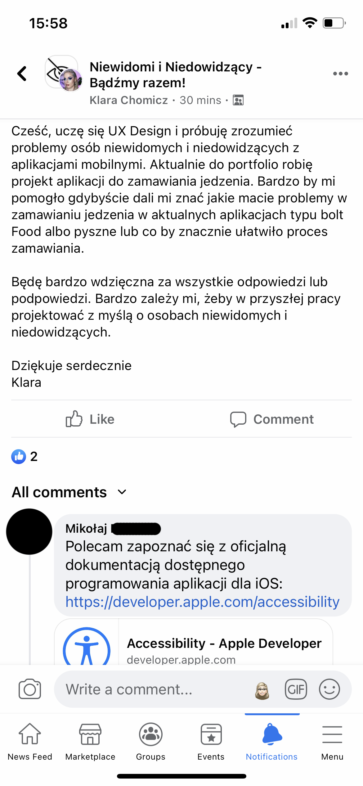
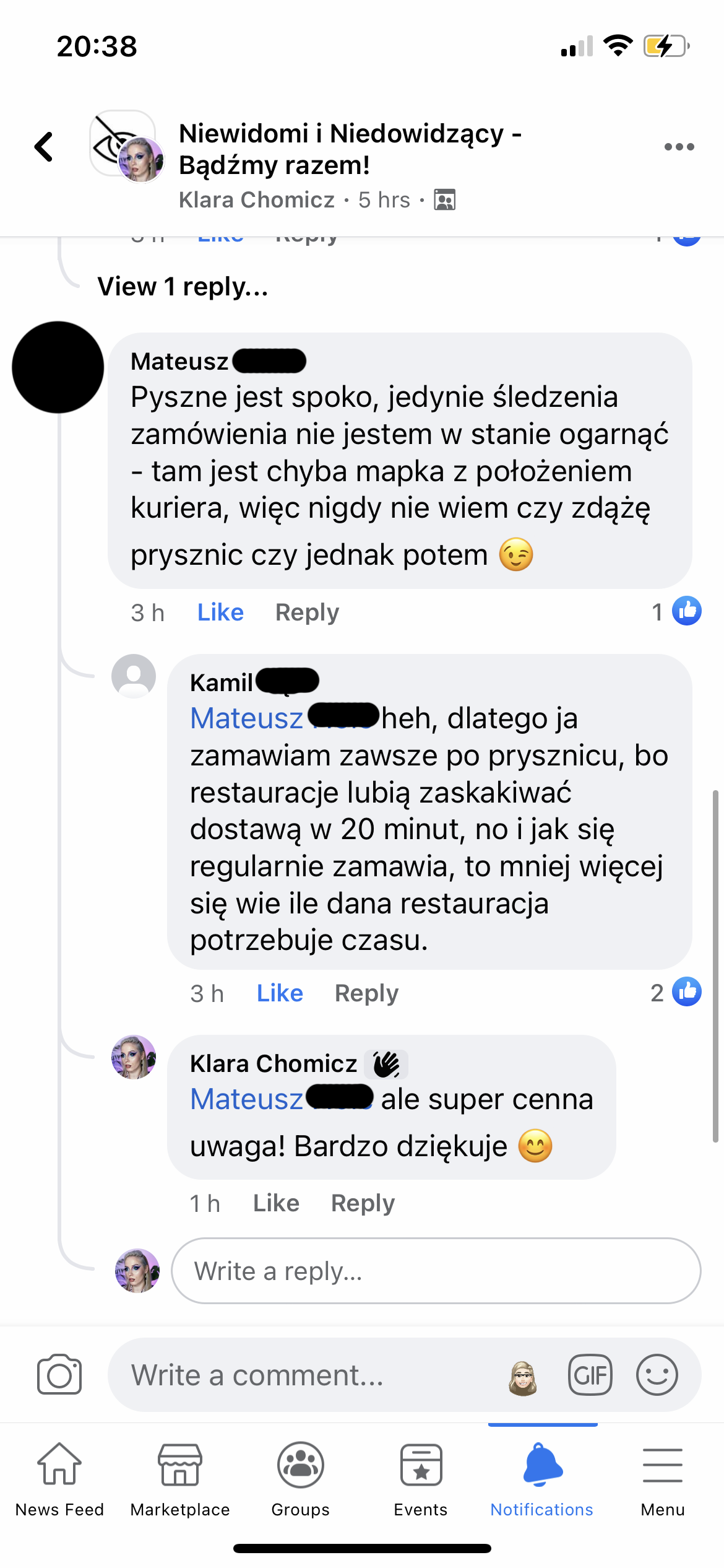
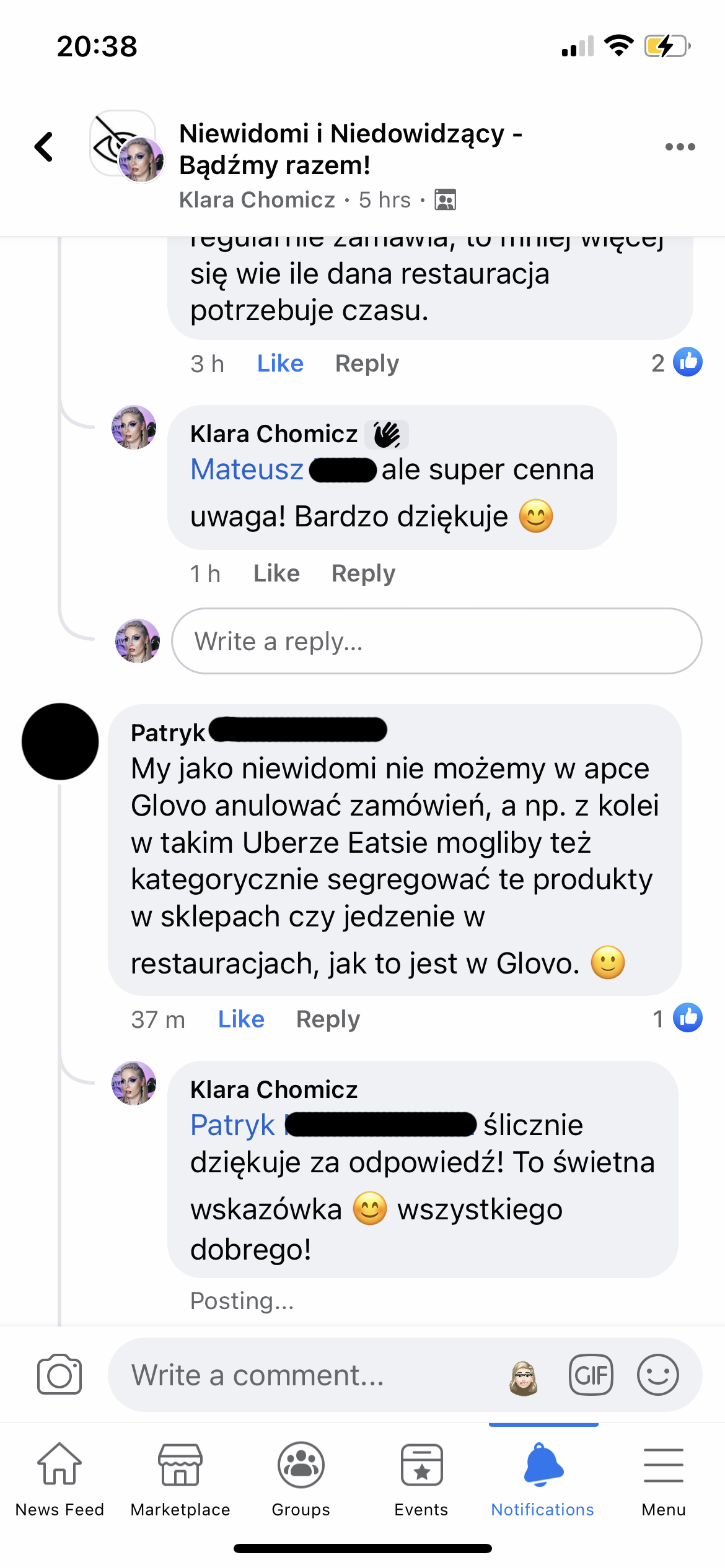
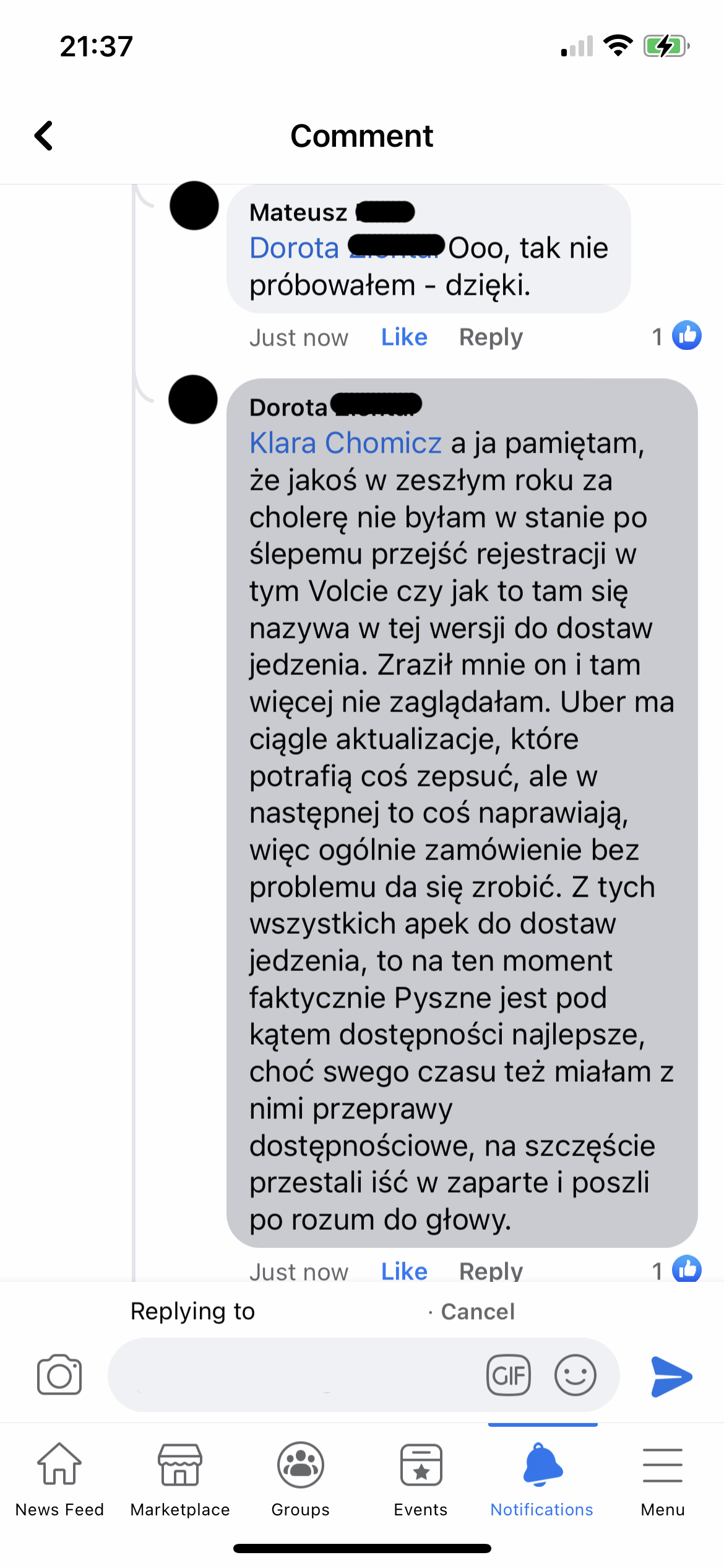
In order to better understand what the competitors do good or bad I reached out to a Facebook Blind and Hard-of-Seeing group. I asked about problems that users experience when ordering food online and if there are any apps that are exceptionally good. The answers surprised me, it turns out the one food ordering app that I dislike the most, which is Pyszne, is the most accessible and easy to use for people using a screen reader. I also found out that some of the apps are unusable. I went into the accessibility settings on my phone to to turn on the screen reader in order to find out what was what was going on and and for example my favourite apps didn’t name their buttons, so it was impossible to navigate the app.
Here are some screenshots from the group, but they’re in Polish, so if you’re not polish then I’m and sorry that you won’t be able to understand what was being said.
2
Information Architecture
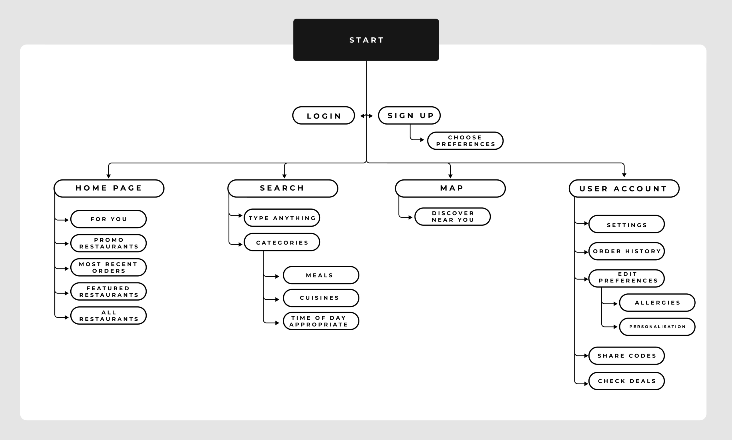
Site Map
While going into the initial site map, it was crucial for me to make this app as simple and straightforward as possible so that it is intuitive and easy to use for most users. I started off with a very clear path that moves through different sections of the app allowing users to navigate at their own pace. I kept the idea of an algorithm on the back of my mind when going through the research and this helped me with the design process when mapping the site.
Journey Map
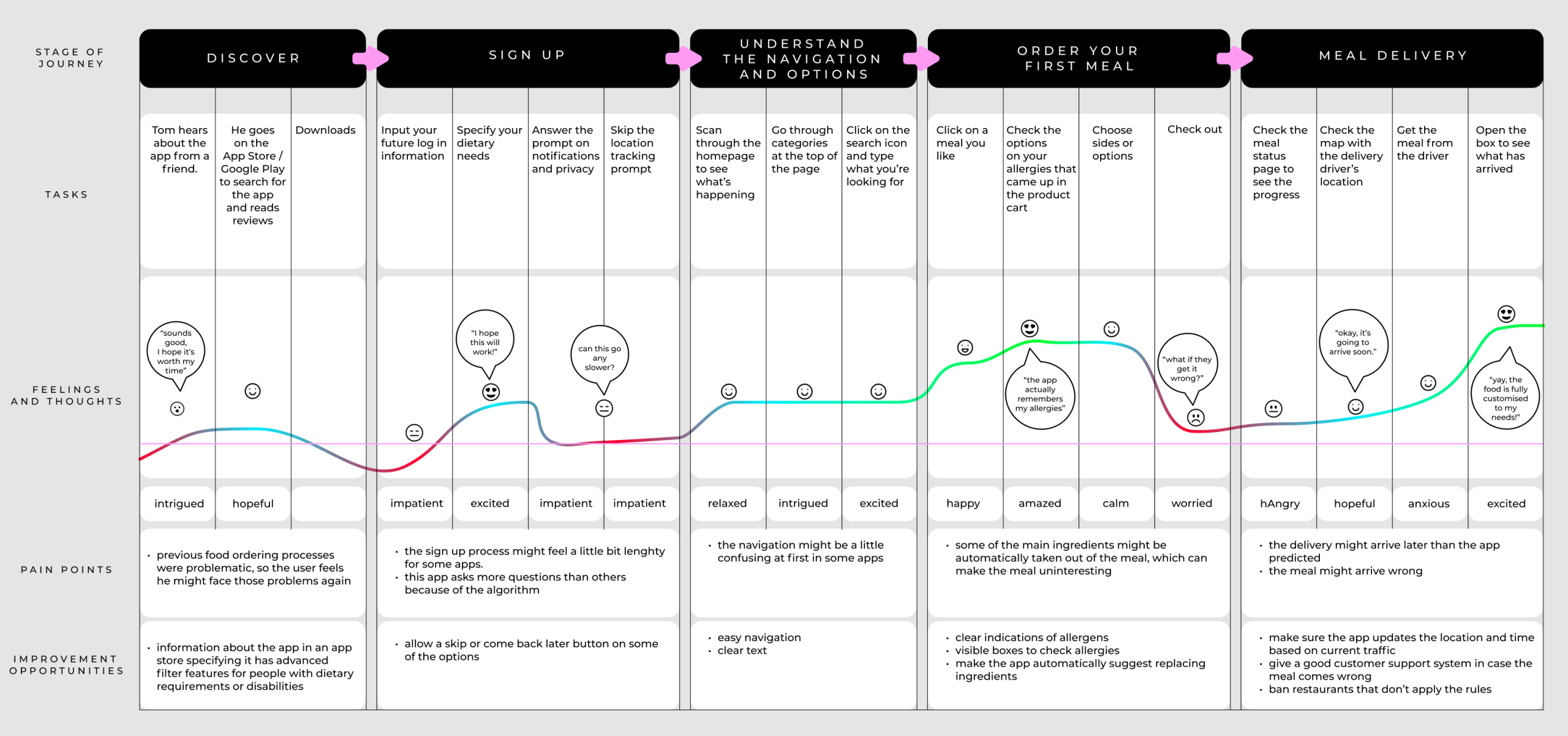
In order to create a truthful depiction of a user’s journey around a food ordering app, I have gone back to see how that experience would be for me. I studied competitive apps to see their strength points and options to see what I would like to add to my app, that would make it more inclusive of those with dietary needs.
Persona: TOM
Goal: Order a meal that is safe to consume for a severely allergic person.
Task flows
While working on the research side of the project I started to develop my ideas further into a more tangible concept.
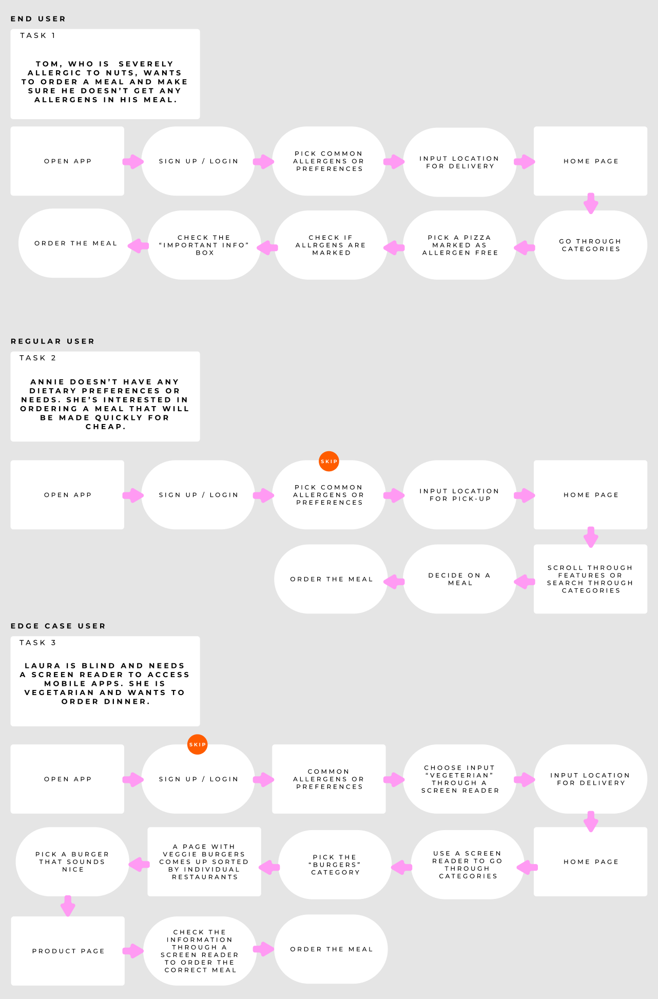
User Flow
Based on my end user Tom, who’s severely allergic to nuts, I decided to create a user flow map in order to explore all of the possible angles an allergic person can go through in order to successfully order a meal online.
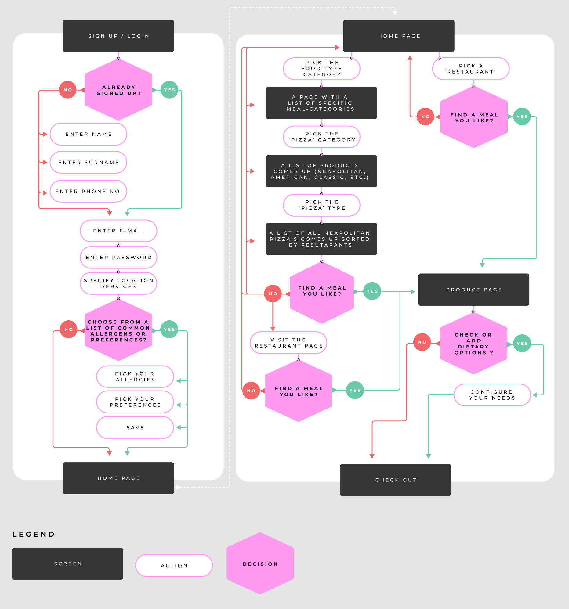
3
Interaction Design
Lo-fi wireframes
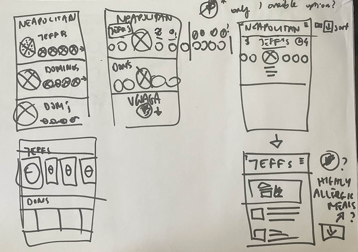
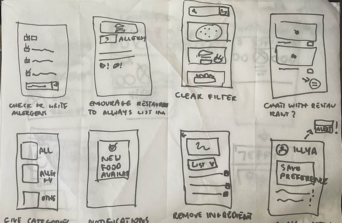
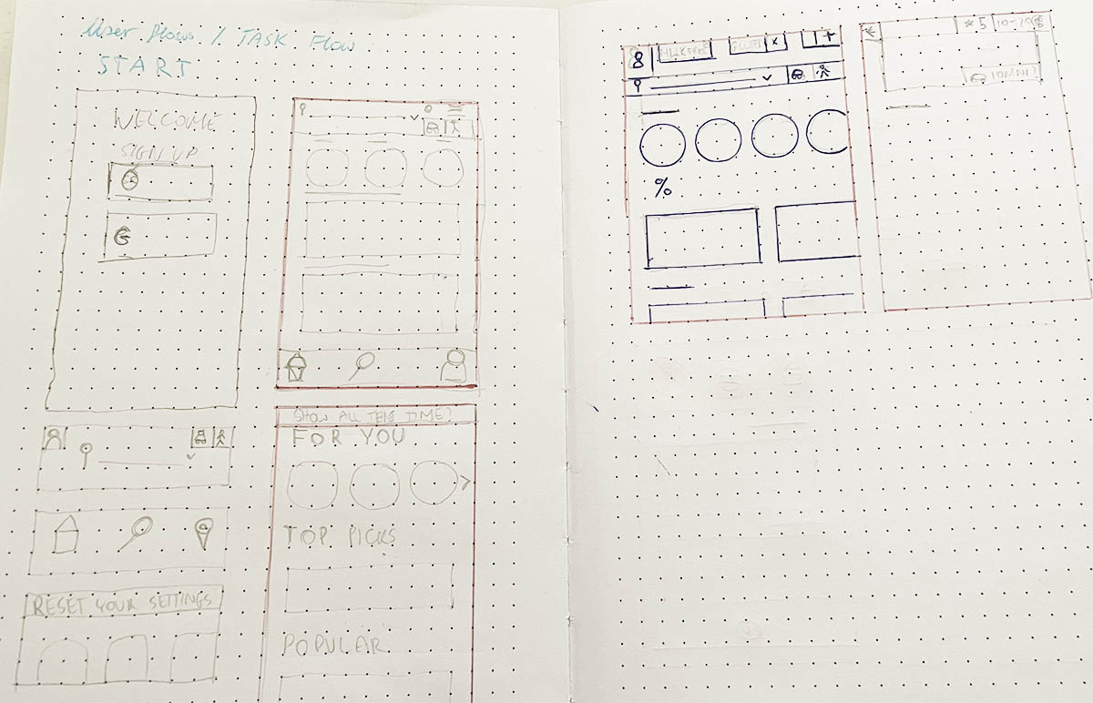
I started the design of this app by coming up with different ideas of how I want the structure of the app to work. First, I did some brainstorming with the Crazy Eight’s exercise. I also drew some quick ideas with a marker when researching the users and competitors. I then proceded to draw the low fidelity wireframes on a dotted paper. In the end I got into a lot more detail in Figma.
Mid Fidelity Wireframes
After my initial sketches I have moved into Figma to create a wireframe based on my previous research. I had a rough ideal of how I wanted this app to look and what additional options to add, so that this truly is an app for all people to feel safe when ordering food.
HI-FI wireframes
I have done a lot of iterations when moving from the low and mid fidelity wireframes to the high fidelity wireframes and prototypes.
In this part of the case study, I wanted to show you how I went from creating a simple wireframe on picking ingredients you don’t want in your food, to a high fidelity wireframe of that idea after doing proper research on dietary allergies, to then the final visual design of the page.
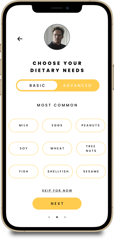
I did more research on allergies to find out which allergies are most common. After reading through multiple medical and allergy-awareness websites, I decided to restructure the initial setup of the app and give users two types of setup – basic and advanced. The basic setup would allow users to pick main categories of allergies such as “milk” or “tree nuts”. The advanced setup would go into much more detail, for example “milk” would allow users to pick subcategories such as “lactose”,”casein”,”whey” or “all milk”.
I also decided to name the setup process “Choose Your Dietary Needs” instead of referring to allergies, so that people do not feel discouraged for selecting an ingredient to avoid without having been allergic to it, for example “no meat” due to being vegan or vegetarian.
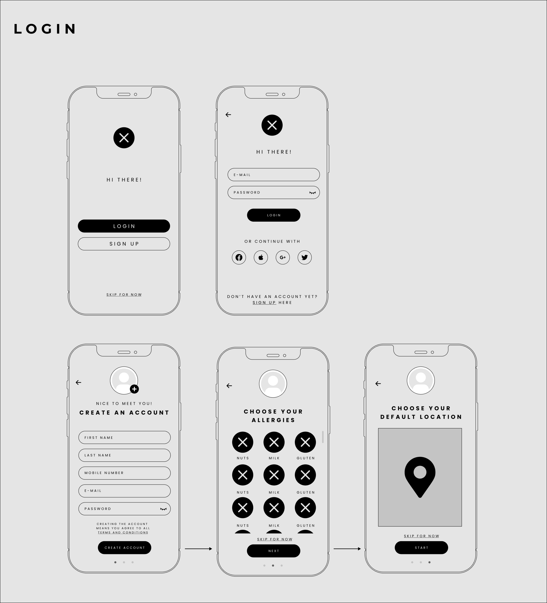
Log in
When first signing up you will be prompted to pick your dietary needs in order for the app to sort through available options and provide the user with personalised meals that are either 100% accurate with the choices or with swapped products where possible.
In case a more specific need wasn’t available, the user could input this information in the box provided at the bottom of the page. The app would search for the keyword and alert the user of the keyword found in the meals. At the same time, the word would be sent to the app centre for verification, if the given answer is viable for publication, then it would be added to the system for future users.
1. mid-fidelity wireframe
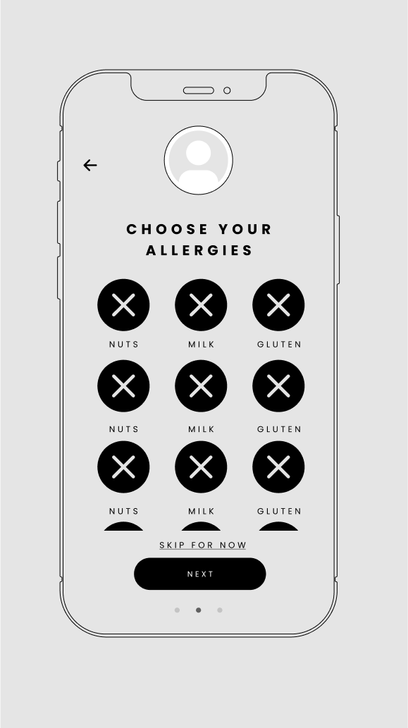
2. high-fidelity wireframe

2. high-fidelity wireframe

3. visual design mockup

UI Kit
Since I’ve been a graphic designer and art director for many years this part of the process was the quickest and easiest to me. I wanted this app to have a modern, classy look. I wanted the typography to be modern and easy to read, so I chose a timeless typeface. I went with mostly toned colours with an accent of bright magenta for important pieces of information.
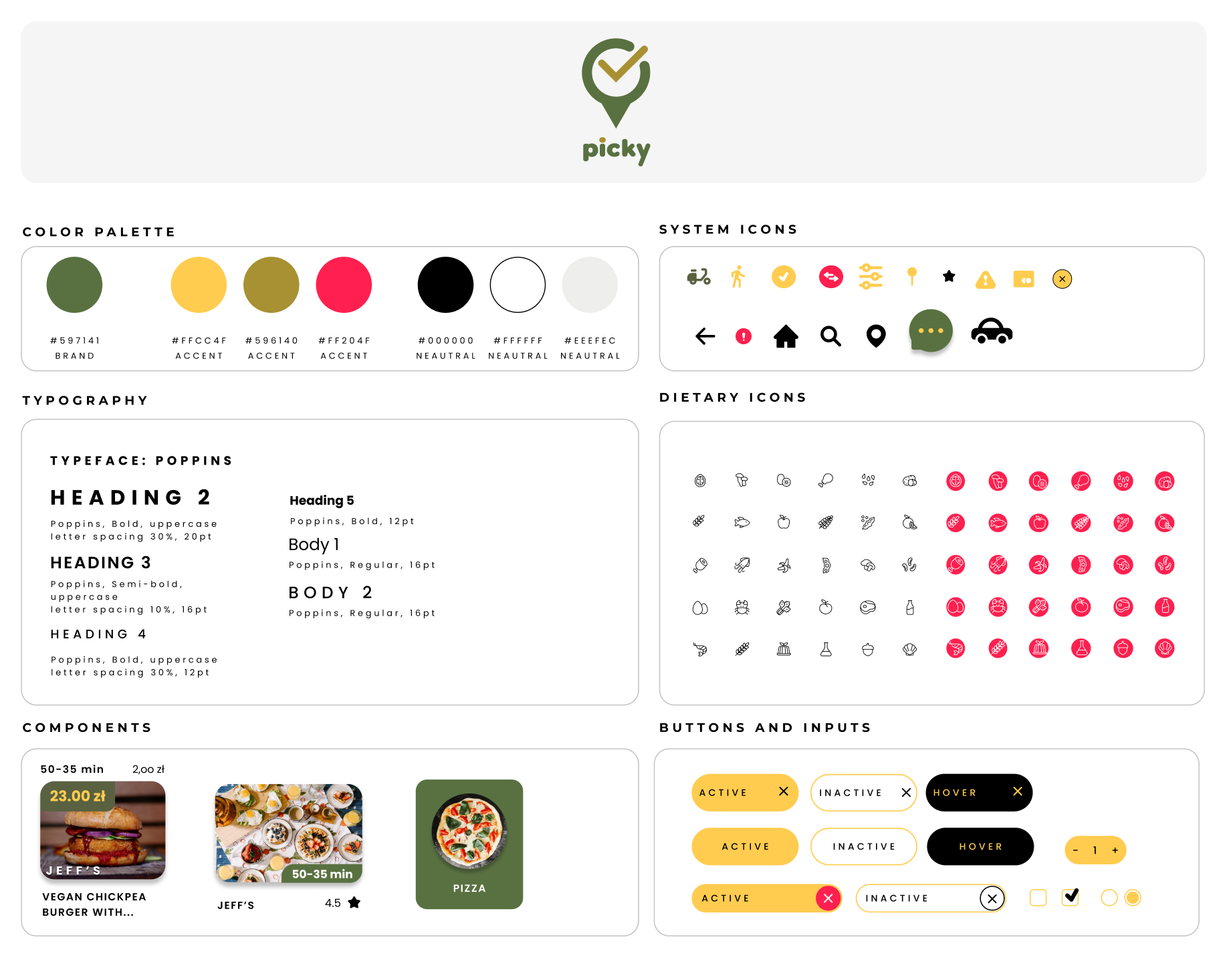
Branding
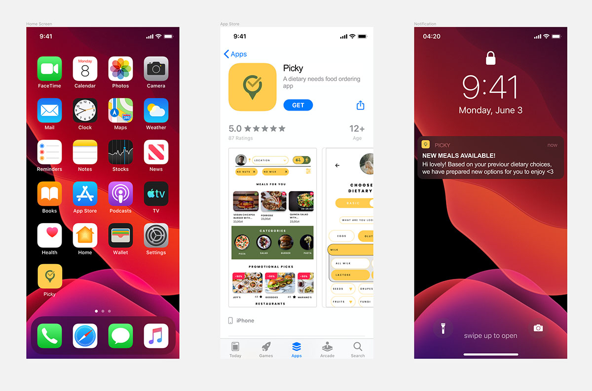
I wanted the logo and name of this app to be simple, memorable and playful.
The name of the app “Picky” at a glance refers to picky eaters, but I felt it was fitting in this instance, since we literally “pick” our ingredients in the app, so that every meal is personalised to our needs.
For the most part I wanted the logo to be memorable and easy to understand instantly. The logo represents a “tick” for when we “pick ingredients” and a location marker since it’s a delivery app.
Visual Design
Since I’ve been a graphic designer and art director for many years this part of the process was the quickest and easiest to me. I wanted this app to have a modern, classy look. I wanted the typography to be modern and easy to read, so I chose a timeless typeface. I went with mostly toned colours with an accent of bright magenta for important pieces of information.
Visual Design – Part 1
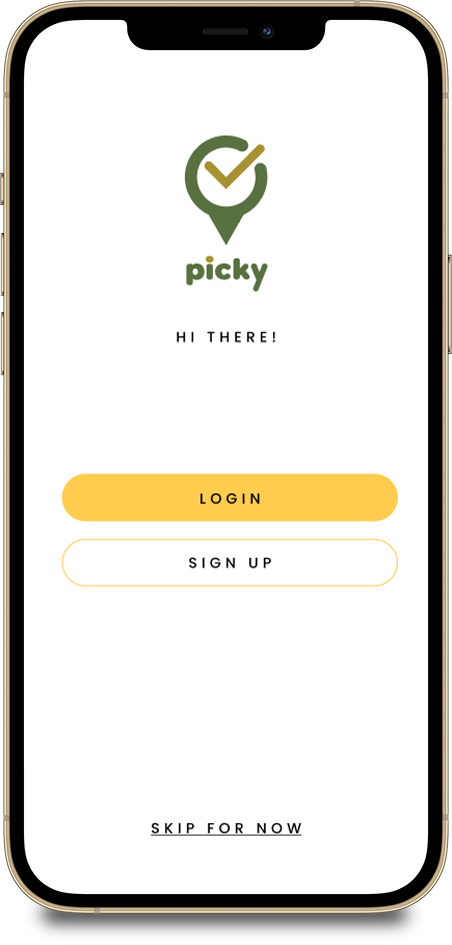
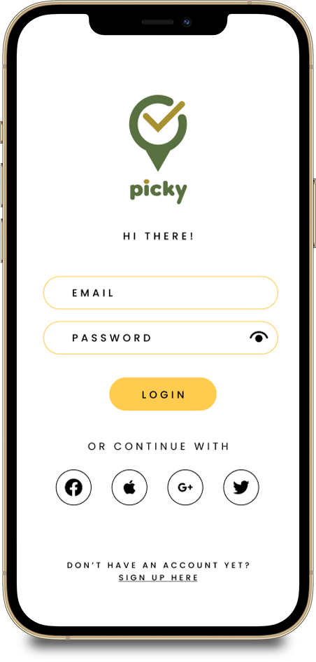
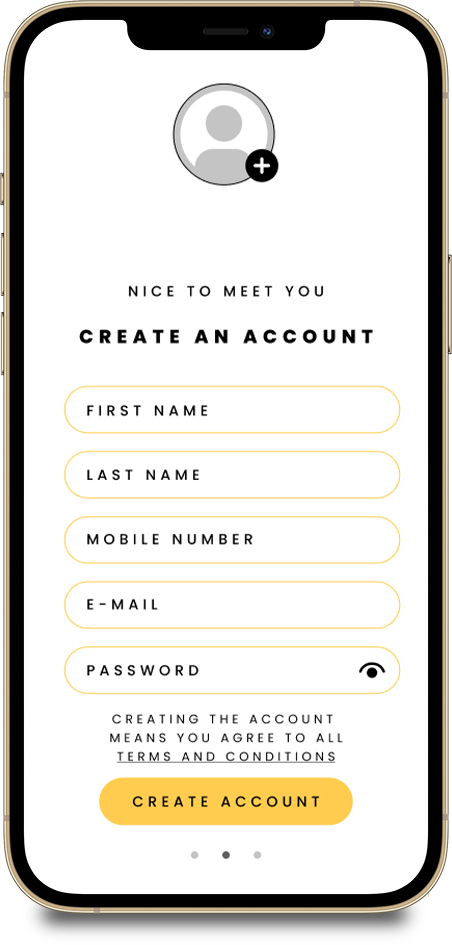
The Sign Up Process.
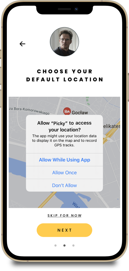
I wanted this part of the design to be very minimal and simple with very clear indications of what to do in order to successfully go through the login or sign up process.
Visual Design – Part 2
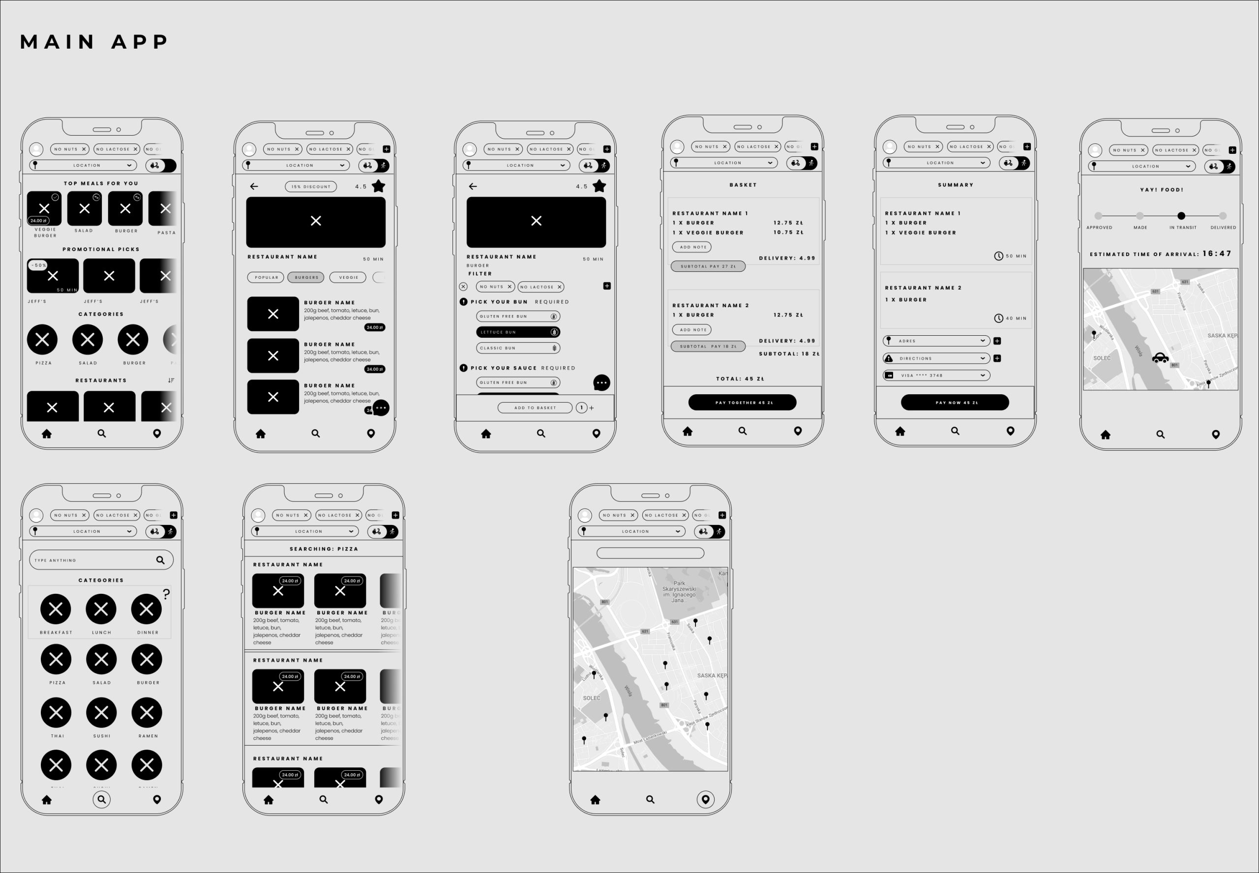
The Homepage and its children.
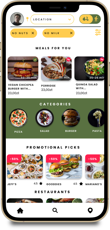
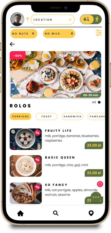
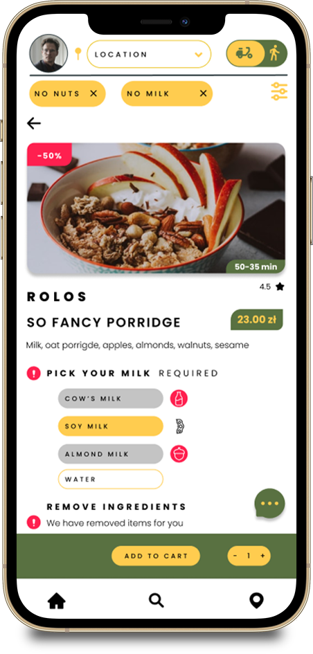
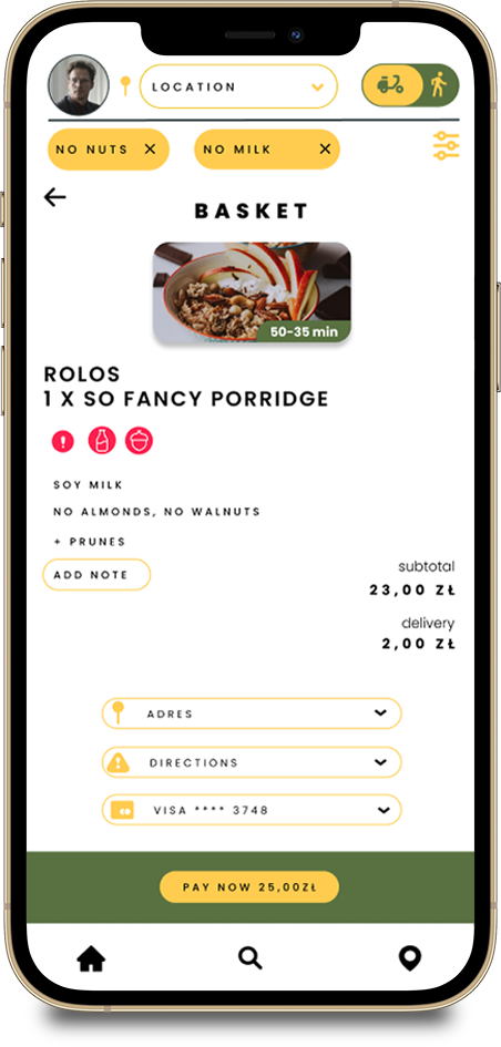
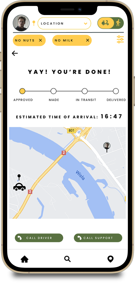
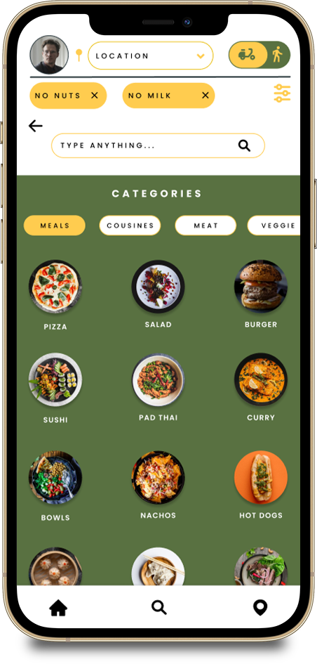
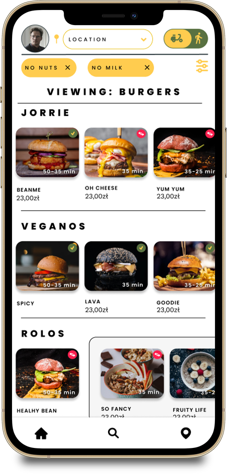
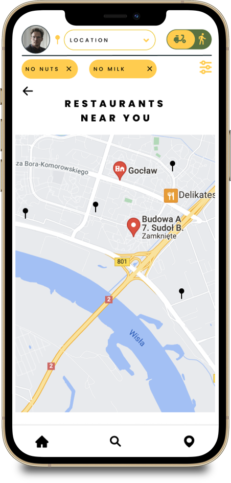
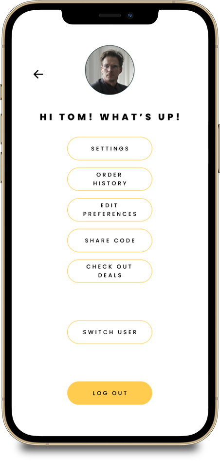
Having successfully signed up or logged in, you would be forwarded to the homepage. I wanted the design to be as simple as possible but it proved to be a difficult task with a lot of iterations. The problem that I faced was in the nature of the app itself. Because of the allergy/preference filter a lot more information had to be added to the app’s components compared to the competitors’ apps. In the end I wanted the information to be very clear to the users, so I decided to give them only the crucial information on the homepage.
Prototypes
I have prepared 4 prototypes for you to see in this part of my portfolio. The first prototype is the sign up process. The remaining 3 prototypes are examples of main user flows for ordering food through the app.
Logging in
The first part of the logging in process is very straightforward, you would choose log in or sign up accordingly. This prototype video briefly shows you how the process goes when you decide to sign up for the service.
Flow 1 – Order meal through homepage
One of the quickest ways to order a meal would be through the personalised suggestions visible on the homepage. The suggestions would get more accurate with time as you use the app more often. The homepage is divided into three sections. The Meal suggestions, categories, promotional restaurants and a scrollable section with all available restaurants.
Flow 2 – Order meal through the search and category page
If the user felt like ordering a specific meal, then they could search it through the Search page. The Search page would also give users very specific meal types based on positions added by restaurants.
Each Category would take you to a dedicated Category Search page with available positions sorted by restaurants. The sorting of the meals would go from most accurate positions to then related meals and finally other meals that the restaurant offers. Other meals would be indicated by a change of the design within the horizontal scrolling feature. A user could also visit each Restaurant page from the Category Search page or go straight to specific meals.
Flow 3 – Order meal through the map page
If the user wanted to check the closest restaurant to them, if for example they wanted to pick up the order themselves, then the Map subpage would help them do just that. The user would simply go into the the Map page, through the bottom navigation. Then, if the location services were allowed, the user would view a close up map with an appropriate radius, showing all of the available options nearby. If the location services were not allowed, the user would be shown a zoomed out map of the entire region where the app is available.
Thank you, love you, bye!
This is the end of this project. Thank you if you managed to get to the very end.
What I learned
This project definitely taught me a lot about user experience. I opened up to a lot of new people because I was trying to find out a lot of information about allergies and the food ordering process for different people. Food is important physically and mentally and ordering shouldn’t come with difficulties!
What I would do different
I guess a lot of the steps I would do differently came with software. As I learned more and more about ins and outs of Figma I would definitely layout my work differently so that it goes quicker next time. Components are a lifesaver and now they are my literal best friends.
In terms of problem solving, I would do all of the allergy research at the very start of the project since this was the biggest objective for this app. I have gone into it after user research, which feels idiotic at this moment in time. I should’ve first learned my allergies, then go into users with them. One of the people I interviewed was severely allergic to citrus. Before that, I had no idea people could literally die from lemons.


